


Web design has spent much of the past decade in a minimalist phase with structured layouts, muted colors, simple typography, and the same cookie-cutter user experience.
That’s starting to change. With AI in the picture, innovation is accelerating, and in response to its polished, uniform output, visual language is getting more expressive and human again.
Designers, developers, and even folks outside the industry are embracing new tools and ideas while holding tight to human traces.
With input from our designers, here’s what to expect from web design in 2027.
Part 1: What Are the UX Trends of 2027
Here are the UX trends of 2027 – from the way you design and build to the way users experience it.
Trend 1: Interfaces Personalize Themselves in Real Time
For years, personalization on the web was limited to pulling a user’s first name in an email or remembering someone’s cart. In 2027, it’ll be bigger and more front and center, with entire interfaces reshaping themselves based on who’s viewing them.
This shows up in two distinct ways.
Contextual personalization customizes content inside a fixed structure – swapping a CTA based on user role, surfacing different pricing for returning visitors, or showing location-specific offers, all within a layout that stays the same.
Generative UI goes further, dynamically building and restructuring the entire interface based on real-time user intent, not just adjusting pieces within it.
Netflix is a familiar example of this already in motion – the platform shows a different homepage to nearly every viewer, shaped by what they’ve watched, and even swaps out thumbnail artwork for the same title depending on what a viewer tends to respond to. Same catalog, same layout, different presentation per person.
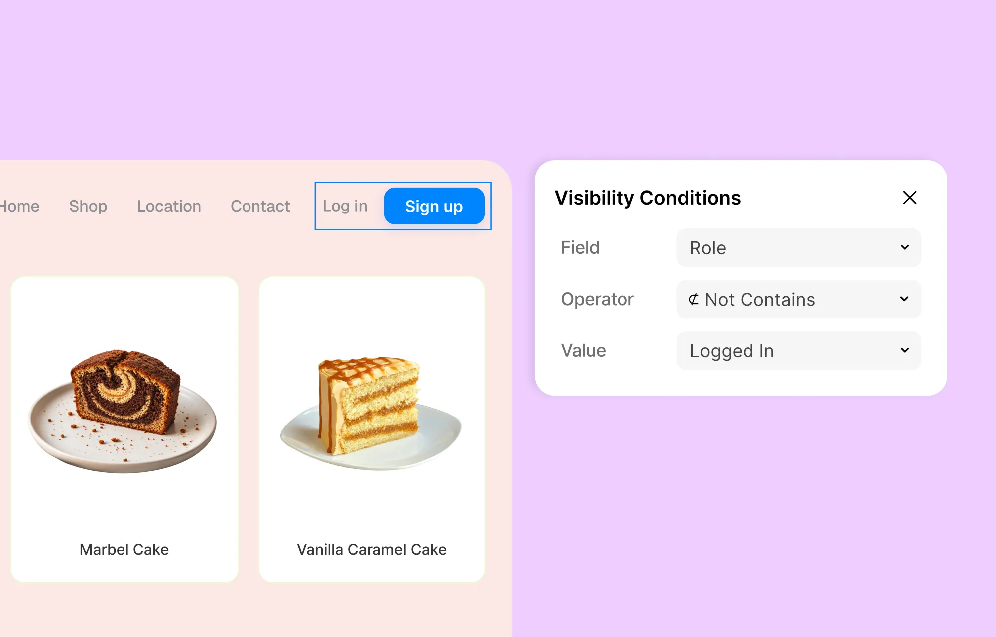
With a modern website builder like Kirki, you can put contextual personalization into practice natively using Visibility Conditions. This lets you control which elements appear based on user criteria like role or registration date and without touching the underlying layout.
You can show a navigation item only to admins, surface a promo exclusively for users who joined during a specific campaign, and more without the need for code.
Trend 2: AI Enters the Design Process, Not Just the Output
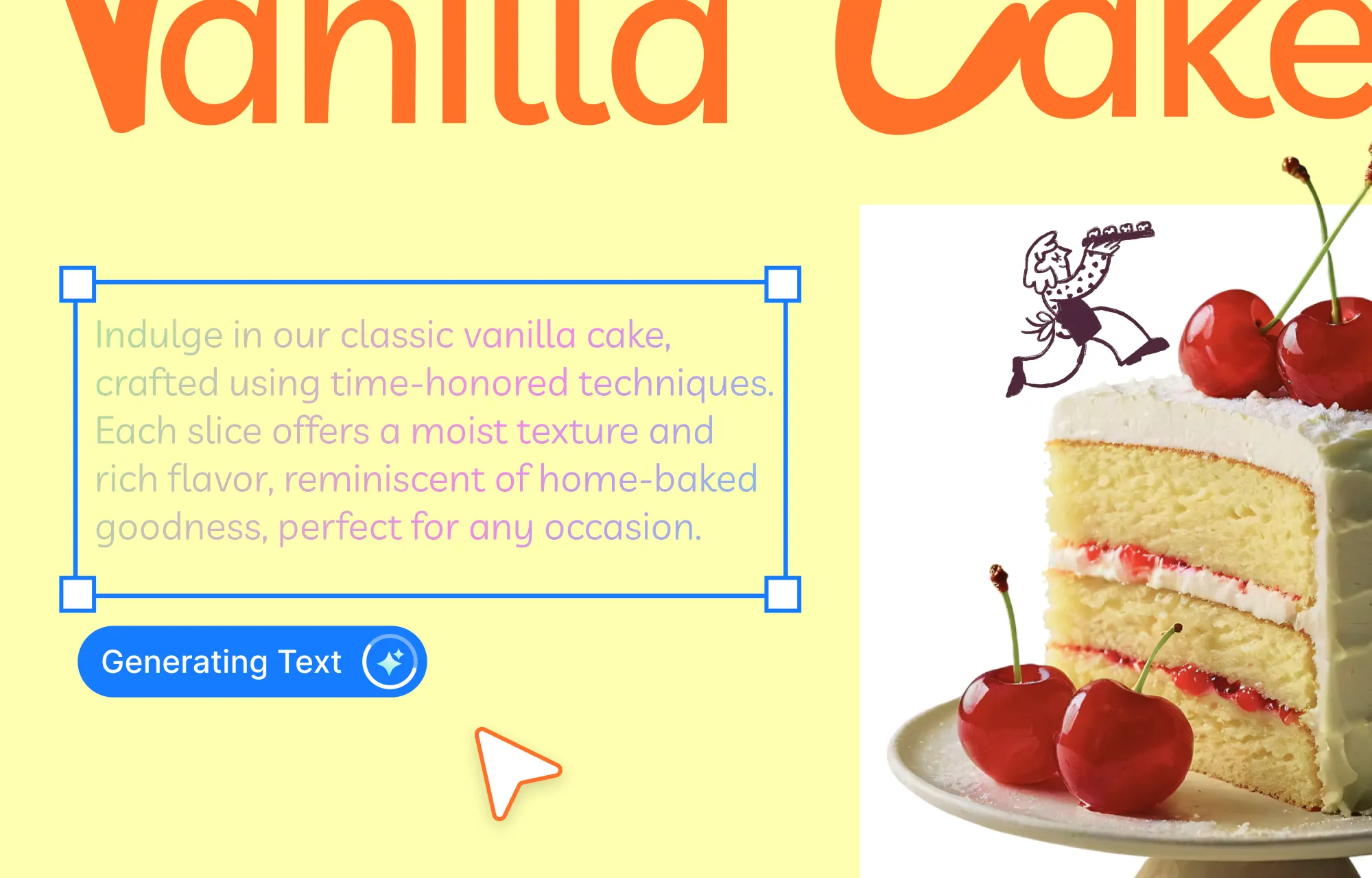
AI’s role in design used to mainly entail content creation, chatbots, etc. That will shift to AI becoming part of the process instead.
It will be less “AI made this” and more AI assisting at each step of the way – such as suggesting layout variations as you build, flagging accessibility issues before you publish, or generating a wireframe that you then shape and edit yourself.
The designer will stay in control of the process, while AI will remove much of the friction that comes with it.
Trend 3: Motion Signals State, Not Just Style
Not all animation is there to look good. Some are built for functionality, not style.
And that’s taking the forefront in the coming year.
A button that shifts on hover tells a user it’s interactive before they click. A progress bar filling in tells them something is happening, not stalled. A form field that highlights red tells them exactly where the error is.
This is motion that shapes the experience, not just the visuals – guiding attention and keeping users from second-guessing an action.
You don’t need fancy code for this either. If you have a tool like Kirki, you can work with Element State-based motion, the Interaction Library, and the Interaction Timeline Editor all visually without code.
Trend 4: Global Design Systems Meet Adaptive Themes
A design system has always been part of the design process, but it used to mean one fixed rulebook – colors, fonts, and sizing, applied the same way everywhere, on every page.
In 2027, that’s shifting. Design systems are staying structured, but the values built into them are becoming adaptive – shifting based on context like user preferences, season, etc., without breaking the underlying system.
Figma popularized this approach, letting designers store a value once and switch between alternate versions – like a Default and Dark Mode palette – without rebuilding anything from scratch.
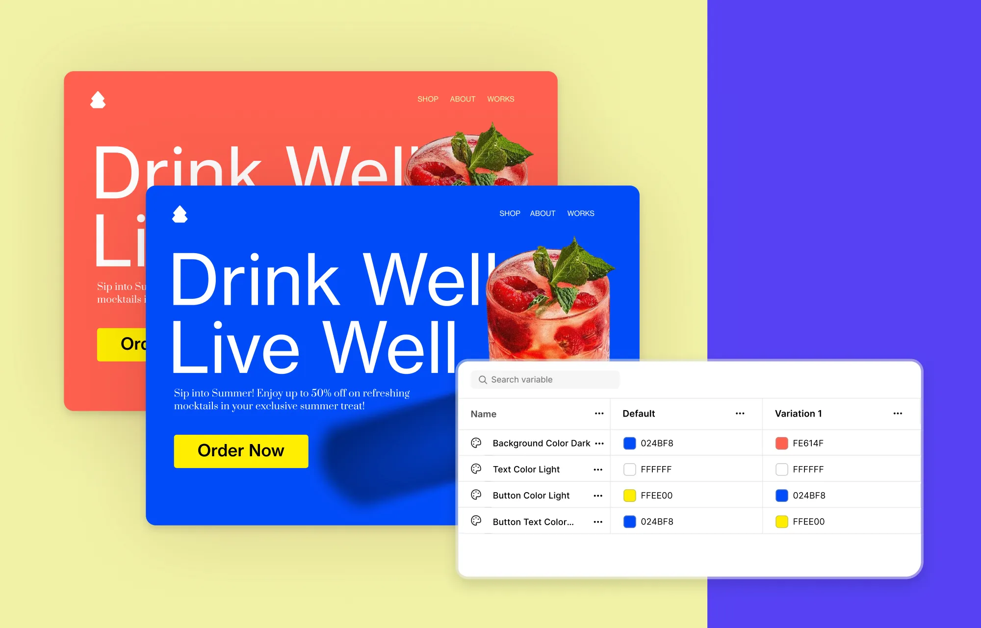
Kirki brings a similar idea to live websites through its Variables and Variable Modes, letting you set different modes per section or page, and even let visitors switch modes themselves, like a dark mode toggle, right on the published site.
Trend 5: Accessibility Remains a Core Design Decision
Unlike most entries on this list, accessibility isn’t a new trend – it’s simply a non-negotiable factor for each year.
What’s changed for 2027 isn’t the idea itself, but where it sits in the process. It will be less of a post-launch checklist item and more of a fixture built in from the first draft.
For this to hold up, the tools need to live right in the design playground; at least, that’s the thinking behind Kirki.
With it, you can check the color contrast between text and background combinations as you select them, add alt text to media elements to keep content understandable for all users, and use ARIA labels to let assistive technology read what would otherwise be anonymous HTML.
Trend 6: Performance and Responsiveness Never Go Out of Style
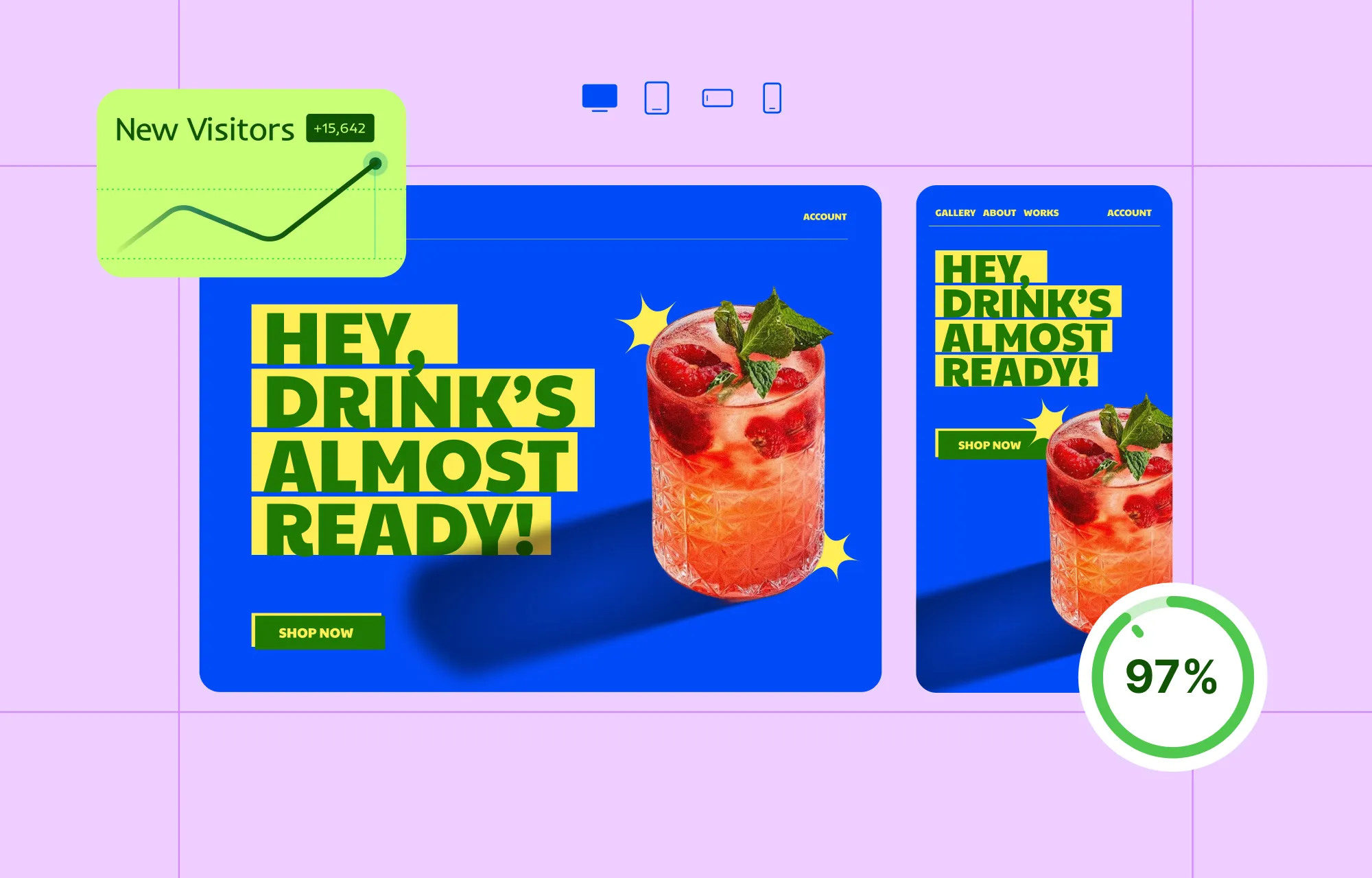
A site can nail every trend on this list and still lose the user in the first three seconds if it loads slowly or breaks on their phone. That’s what keeps performance and responsiveness on every list year after year.
If anything, the bar keeps rising: Slow sites don’t just frustrate users but get penalized by search engines and abandoned before they finish loading.
This is where a lot of page builders lose the plot, stacking on plugins and add-ons that generate clunky, bloated code. Kirki avoids those pitfalls entirely – no bloated output, no extra plugins or add-ons required, no third-party JS scripts weighing pages down, just compressed JS and CSS by default.
Responsiveness gets the same treatment. Instead of switching between device views to check your work, Kirki’s side-by-side Breakpoints let you see and adjust how a page looks across devices at once – and you’re not limited to a few breakpoints; instead, you can add as many custom breakpoints as a design actually needs.
Part 2: What Are the UI Trends of 2027
Here are the UI trends that will define the visual language of 2027 – breaking away from polished uniformity and bringing more character into web design.
Trend 7: Human Imperfection Pushes Back Against AI Polish
Canva dubbed 2026 the year of “Imperfect by Design” in its design trends forecast. And according to the company’s Executive Creative Director, messy, inconsistent, human touches aren’t flaws anymore – they’re part of what makes design feel genuine.
Behance’s own trend report for the past year points to the same. With AI everywhere, the human factor is becoming the differentiator.
With the AI boom continuing, this is something we can see carry over to 2027 as well. The more AI shapes what gets made, the more the human touches left in will matter.
In practice, this looks like collage-style layouts, varied textures, freely placed elements, hand-drawn details, and imperfections left in on purpose – anything that signals a person made the decision, not a bot.
Trend 8: Cultural References Replace Homogenized Design
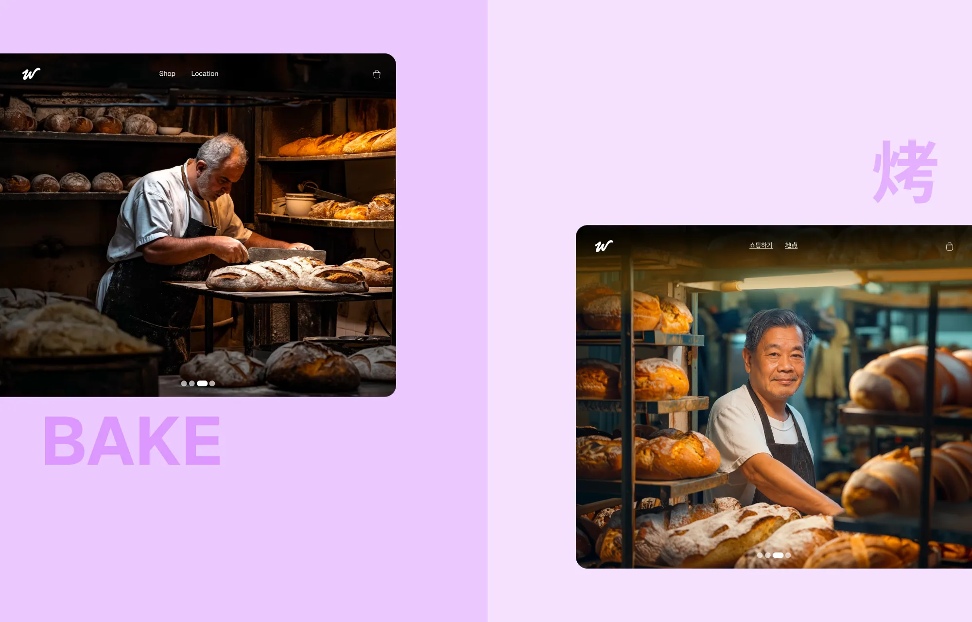
For years, “globally friendly” websites meant stripping out anything culturally specific, opting for neutral color palettes, generic photography that feels like stock photos, interchangeable copy.
In recent years, that’s reversing. Sites are leaning into regional visual language: local typography and imagery rooted in an actual place, time, or culture, instead of smoothing everything into one homogenized look.
For instance, UNIQLO does something similar in its approach – compare its Japanese and Korean websites, and you’ll see how the visual presentation adapts to each market rather than following one identical template.
Trend 9: Glassmorphism Returns With More Restraint
Glassmorphism has had its moment over the years – frosted, translucent panels that eventually faded out as flatter, simpler interfaces took over. Apple brought it back in a big way in 2025, introducing Liquid Glass at WWDC and rolling it out across iOS, iPadOS, and macOS.
So, what does that mean for 2027? Use it, but as an accent, not a foundation. The effect can make an interface feel polished and premium, but when it’s applied to everything, it can quickly hurt legibility, overwhelm the visual hierarchy, and potentially add unnecessary performance overhead.
Instead, add it to highlight a navigation bar, card, modal, or other focal element while keeping the rest of the interface clean and grounded.
Tools like Kirki make this easy to achieve, with a built-in Glass Effect feature that lets you give individual elements that frosted, translucent treatment directly in the editor – no custom CSS required.
Trend 10: Bold Color Palettes Forgo Minimalism in 2027
Minimalist web design has leaned heavily on white space, soft neutrals, and muted palettes for years. In 2027, expect more websites to break away from that formula with brighter colors and stronger combinations.
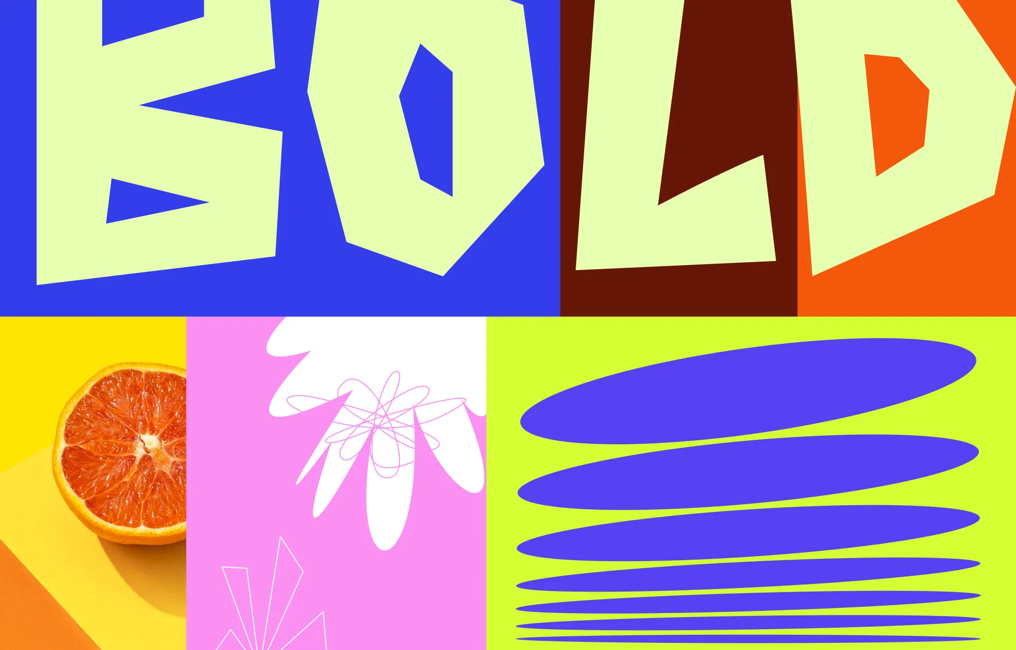
This shift is already visible. Figma highlighted vibrant color palettes as a 2026 trend, with sites like Starface using bold colors as a key part of their visual identity. WGSN is also pointing toward brighter, more expressive colors, naming Luminous Blue its Colour of the Year for 2027.
For websites, this could mean a bright hero section, saturated buttons, unexpected color pairings, or simply using one strong color against an otherwise simple layout. The idea isn’t to make everything loud – it’s to stop treating color as something that needs to play it safe.
Why Follow Web Design Trends
Keeping up with web design trends helps your website stay fresh, modern, and relevant as the web evolves. You don’t need to adopt every new idea – just find the ones that fit your brand, audience, and goals.
With Kirki, you can experiment with ideas like bold color palettes, glass effects, adaptive themes, and interactive elements directly in the visual editor.
So start exploring these trends today, and make them your own.

