Picture this — you’ve designed a stunning website that should wow your audience. But instead, you’re seeing high bounce rates and wondering what went wrong.
Chances are, you missed one crucial detail: your site isn’t built to adapt across the growing range of devices people use to browse the web.
This is where breakpoints come in! Sit tight as we explore what breakpoints are in web design and how to use them to make sure your website looks its best on any device.
Breakpoints Explained — And Why You Need Them
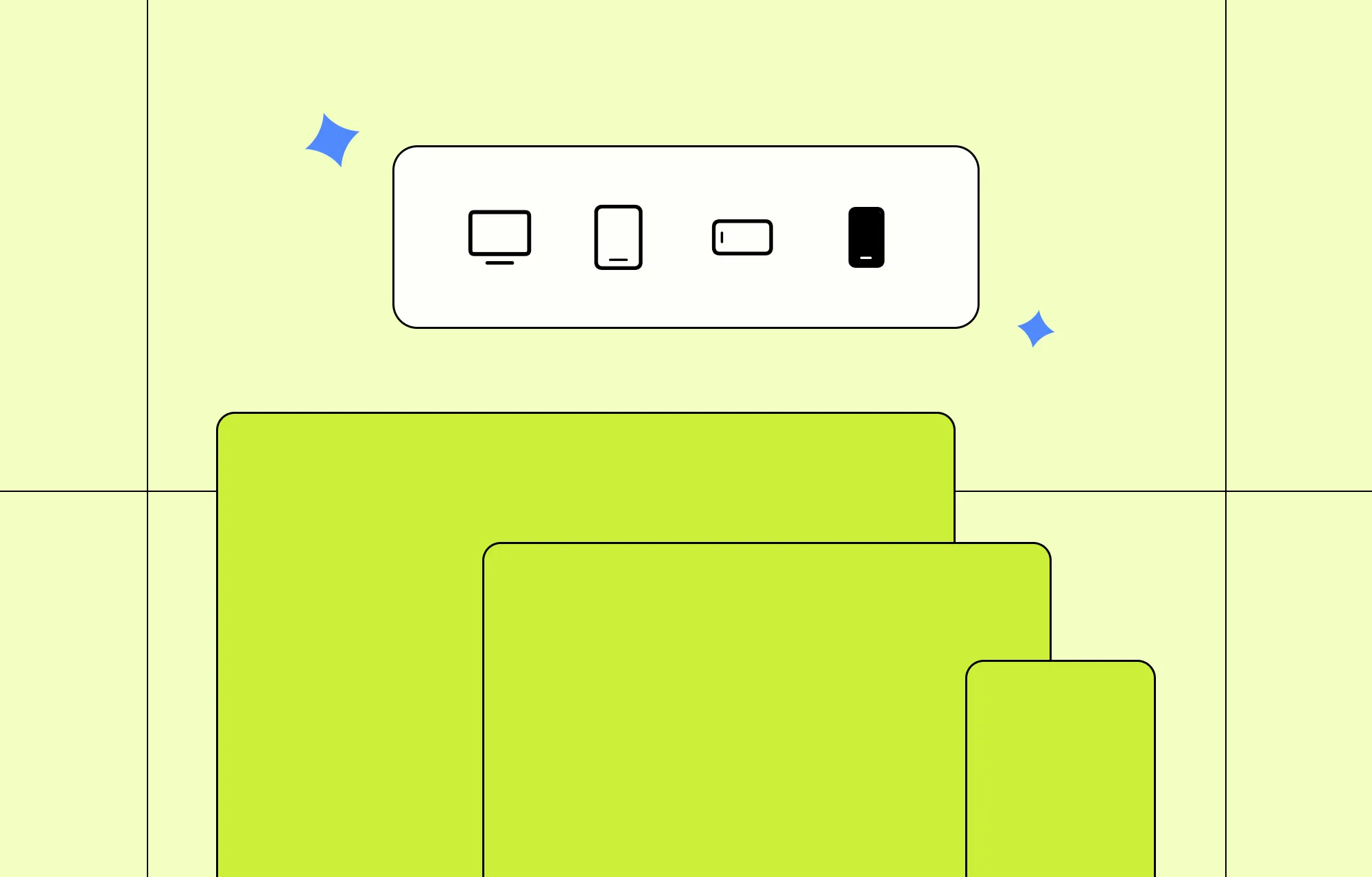
Website breakpoints are essentially predefined screen sizes that a website’s design and layout will automatically accommodate.
From desktops to mobile phones and everything in between, breakpoints let you say goodbye to awkward layouts and hello to a seamless website experience across every device.
Here’s a quick breakdown of why breakpoints should never be optional in web design:
Seamless User Experience: The entire point of using breakpoints in web design is to ensure a seamless user experience across all devices.
Better Engagement, Lower Bounce Rate: Users will bounce immediately if they land on a site with a broken layout or poor accessibility. A seamless website experience across devices ensures they stick around longer.
Improved Accessibility: An accommodating design ensures that everyone, including users with disabilities, can access your website more easily on their preferred devices.
Expanded Audience: When your website looks flawless on more devices, you open the door to a wider audience. And more audience usually means more visitors to possibly convert.
Enhanced Professionalism and Credibility: A seamless website experience across platforms doesn’t just look good. It also solidifies your brand’s professionalism and builds trust from the very first impression.
How to Use Website Breakpoints With No Code
By now, you know breakpoints are a crucial part of responsive website building. But how do you use them without writing a single line of code?
Using the right no-code website builder, of course!
Finding the Right Website Builder
Not all website builders are truly no-code, nor do they handle breakpoints the same. When hunting for the perfect fit, keep these key things in mind:
Side-by-Side Responsive Editing: Look for a website builder that lets you see and work on all your breakpoints simultaneously so you can design responsively without switching modes.
Custom and Unlimited Breakpoint Support: Your chosen tool should support custom breakpoints beyond the standard presets. Bonus points if it supports unlimited breakpoints!
Live Preview for All Devices: Don’t leave your layouts to guesswork. Choose a builder that offers a real-time preview of your design across all breakpoints as you work.
Drag and Drop Editor With Granular Control: Find a website builder with a drag and drop editor and granular controls, giving you the freedom to fine-tune your design for every device.
The answer to all of this is the Kirki WordPress website builder!
With Kirki’s infinite canvas, all your breakpoints — Desktop, Tablet, Landscape, and Mobile — are visible side by side simultaneously. You can work directly on any breakpoint view on the canvas, see changes in real time across all screen sizes, and fine-tune each one without switching modes.
Kirki also follows a hierarchical approach, meaning any changes you make for a larger viewport automatically cascade down to smaller ones. This ensures a consistent, cohesive design across devices and saves time by eliminating the need to repeat the same tweaks for every screen size.
Working With Breakpoints in Kirki
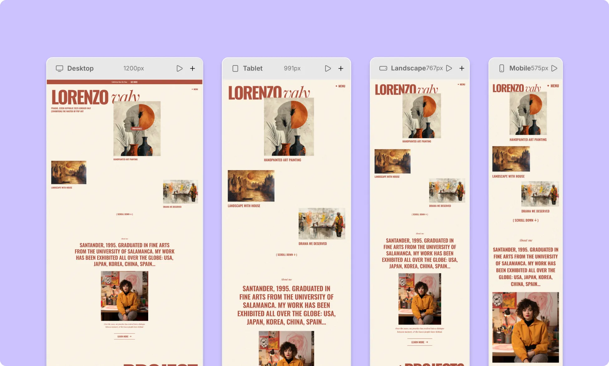
In Kirki, all your breakpoints are displayed side by side on the infinite canvas. Simply scroll horizontally to see all breakpoint views and click directly on the one you want to work on. Any changes you make will apply to that specific breakpoint without affecting others.
Adding Custom Breakpoints
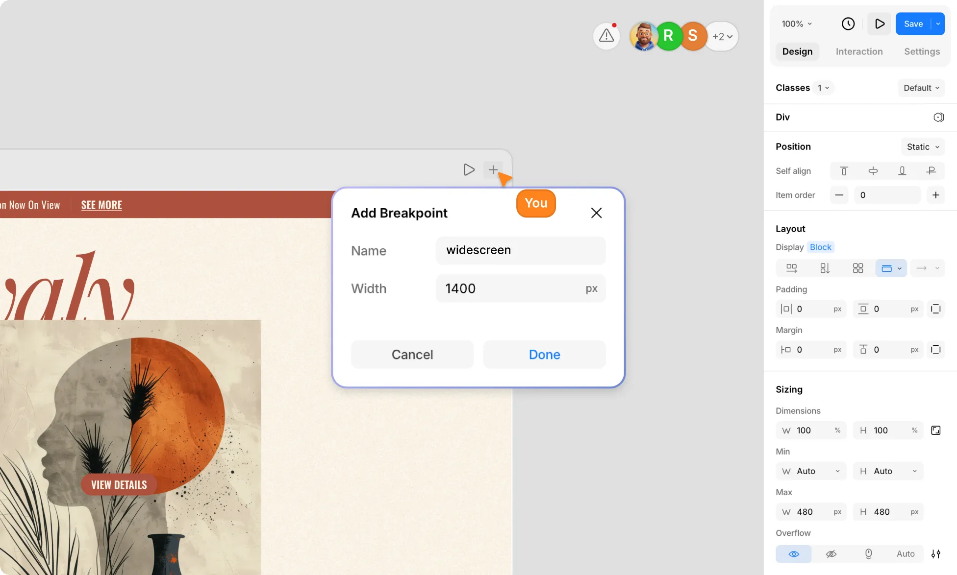
If the default breakpoints don’t quite fit your needs, no worries! Kirki supports unlimited custom breakpoints.
To add a custom breakpoint, click the “+” icon on any breakpoint view on the canvas. An Add Breakpoint modal will appear with a Name field and a Width field in px. Enter your desired screen width, give it a name, and click Done to save.
Your new custom breakpoint will appear on the canvas alongside the existing ones, ready to design for.
How to Style Elements Across Different Breakpoints
Here’s how to design responsively in Kirki:
Step 1: Start with the Desktop view. It’s your foundation, and all breakpoints inherit from it. Design your layout fully on Desktop first before moving to smaller screens.
Step 2: Use the side-by-side view to spot issues. Once your base layout is in place, Kirki’s infinite canvas lets you see all breakpoints simultaneously. Scroll across to quickly identify where your design needs adjustment across screen sizes.
Step 3: Apply your changes directly on the canvas. Click on the breakpoint view you want to refine and make your adjustments using the options in the Design tab on the right panel — whether it’s changing layout direction, adjusting spacing, resizing elements, or tweaking typography.
Your changes will cascade automatically to smaller breakpoints, so you can build a fully responsive website efficiently without having to redo adjustments over and over.
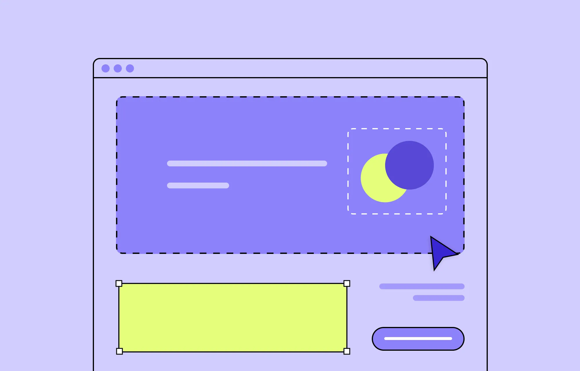
Hiding Elements for Specific Breakpoints
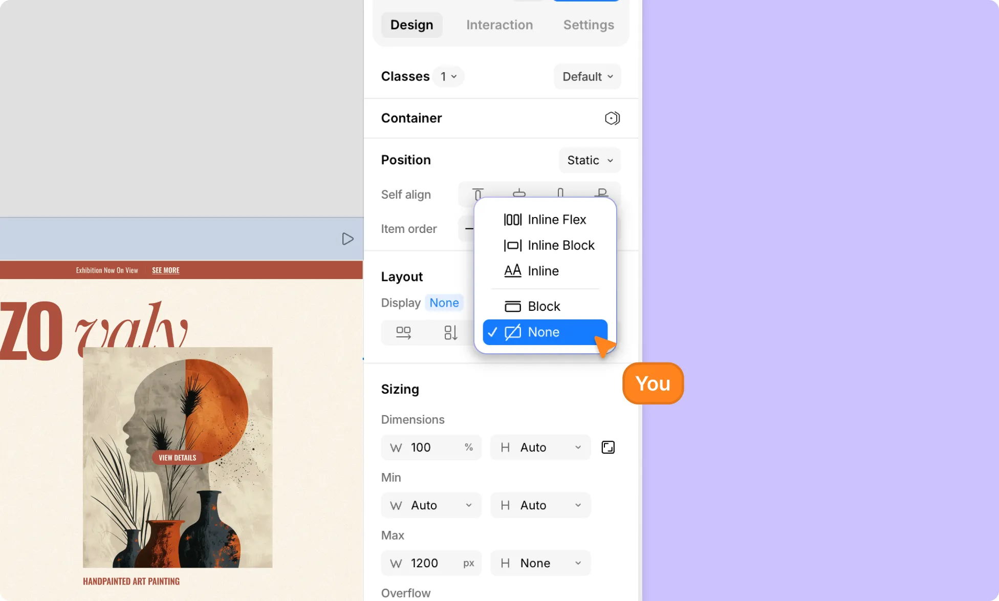
Another powerful way to declutter your design on smaller screens is to hide elements for specific breakpoints. Here’s how:
Step 1: On the infinite canvas, click on the breakpoint view you want to optimize for.
Step 2: Select the element you want to hide on that breakpoint.
Step 3: In the Design tab, go to the Layout section and click the Display dropdown. Select None to hide the element completely on that breakpoint.
The element will remain visible on all other breakpoints where you haven’t made this change.
Choosing the Right Breakpoints
Learning the standard breakpoints used across the web design industry is the first step toward choosing the right ones for your project.
While every site is unique, most bases can be effectively covered with breakpoints for Desktop, Tablet, Landscape, and Mobile. Based on these conventions, Kirki’s default breakpoints are:
- Desktop — 1200px and above
- Tablet — 991px
- Landscape — 767px
- Mobile — smaller screen sizes
These widely recognized widths are a solid foundation to start building responsive WordPress websites.
Factors That Influence Breakpoint Selection
Choosing the right breakpoints isn’t always about sticking to the defaults. These factors play a role:
Website Purpose: The type of website you’re building can greatly impact how many breakpoints you’ll need and at what widths.
Target Audience and Devices: Consider the devices your audience is most likely to use. Are they primarily desktop users, or do they prefer hand-held devices?
Content Structure: Depending on how your content is structured, certain breakpoints may be needed for improved readability.
Design Complexity: The more complex your layout and interactions, the more breakpoints you may need. Highly animated designs often require finer control across various screen sizes.
Best Practices for Website Breakpoints
Knowing how to use breakpoints is only half the journey. Here are some best practices for optimal results:
Use Responsive Units: Use relative units like percentages for images and em or rem for text to ensure smooth scaling between breakpoints, reducing the need for excessive micro-breakpoints.
Design With Flex and Grid Layouts: Flexible layouts like Flex and Grid adapt more naturally to different screen sizes and content changes, making responsive design far more manageable.
Reserve Absolute Positioning for Minor Elements: Only use Absolute Positioning for small, controlled elements like icons or tooltips. Avoid it for core layout structures as it removes elements from the normal page flow and can break responsiveness.
Don’t Go Overboard With Breakpoints: Only add breakpoints that serve a clear purpose, like when a layout breaks or content becomes hard to read. Unnecessary breakpoints only complicate things.
Maintain Visual Hierarchy Across Breakpoints: While Kirki’s hierarchical breakpoint system helps preserve design consistency, ensure your visual hierarchy for typography, spacing, and content order remains clear and consistent across all devices.
Restructure, Don’t Just Shrink: Instead of simply scaling elements down to fix a layout, rethink the structure entirely for smaller screens. A thoughtfully restructured mobile layout always beats a shrunken desktop one.
Test on Real Devices: While Kirki’s infinite canvas lets you preview all breakpoints in real time, it’s always best to test on real devices at least once to catch any hidden issues.
Elevate Website Experience With Kirki
Now you know everything there is to know about what breakpoints are in web design and how to use them in Kirki!
So what are you waiting for? Get Kirki today and start building WordPress websites that stun your audience no matter the device!