Get ready to learn how to craft a mobile-friendly website with no code! This ultimate guide will show you how to effortlessly create seamless web designs that look stunning on any mobile device while ensuring a top-notch user experience.
Importance of Mobile-Friendly Websites
Before we dive into the guide, let’s take a moment to explore the importance of crafting mobile-responsive websites and the incredible benefits it brings:
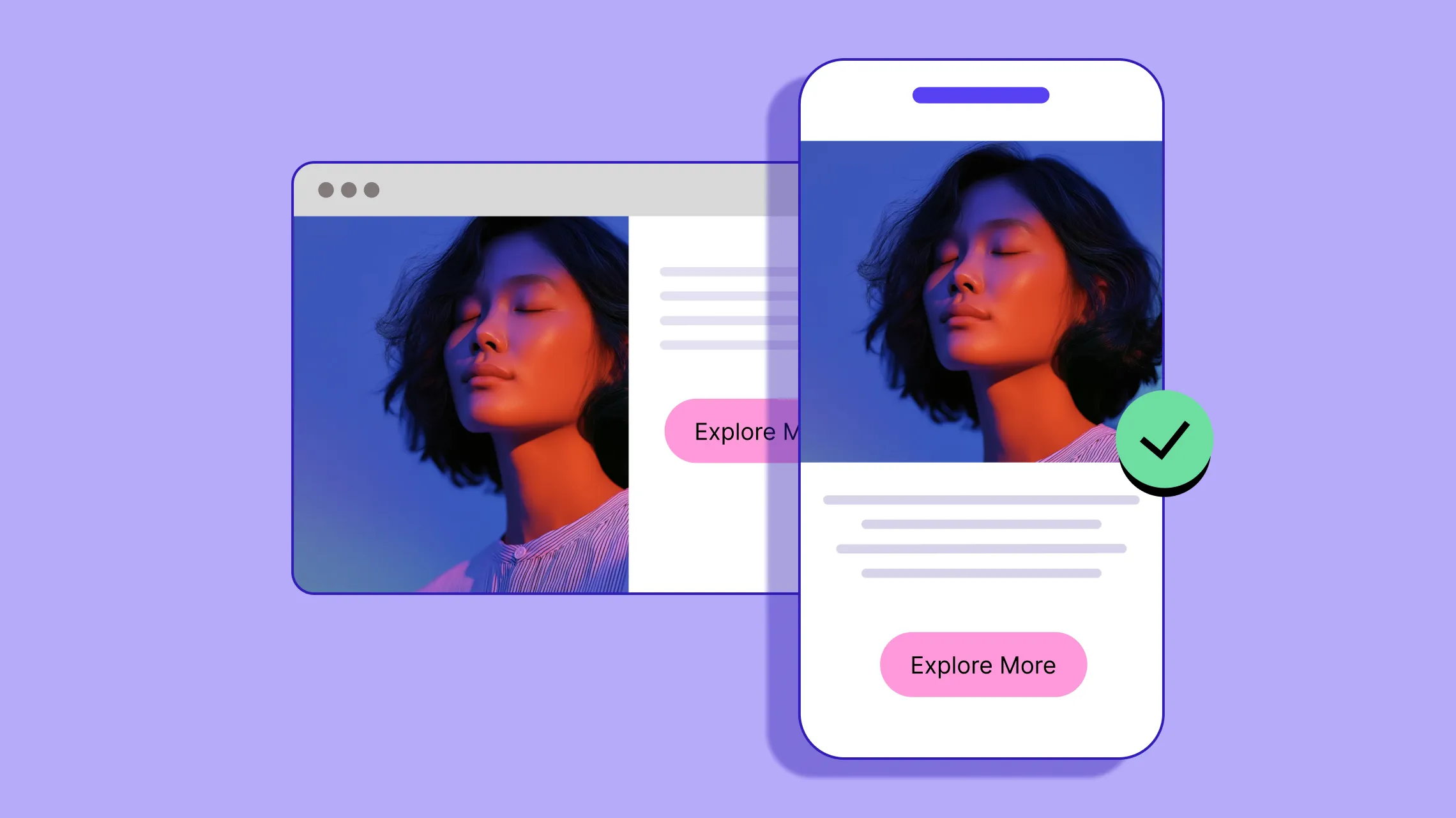
Improved User Experience: With over half of web users on mobile, a mobile-friendly design ensures a smooth, seamless website experience across all such devices.
Lower Bounce Rates: Ensuring your website is seamlessly accessible on mobile devices reduces the chances of visitors leaving right away, lowering your bounce rate significantly.
Enhanced Search Visibility and Mobile SEO: Search engines like Google prioritize mobile-responsive websites, boosting your site’s SEO and enhancing its visibility on search results.
Increased Lead Generation: Mobile-friendly websites are easily accessible on smartphones, making it more likely for users to engage, interact, and convert, ultimately boosting lead generation.
Expanded Audience Reach: Not everyone owns a desktop or laptop, but almost everyone has a smartphone. A website optimized for mobile ensures your content reaches a broader audience, making it more accessible to all.
Better Social Media Integration: Mobile-responsive websites are easier to share and view across social media platforms, further increasing your reach and visibility.
Improved Brand Credibility: A mobile-friendly website is crucial for professional brands today and directly boosts credibility and trustworthiness in the eyes of visitors.
These are just a few of the most prominent benefits of having a mobile-friendly website, but its impact goes far and wide!
How to Craft a Mobile-Friendly Website With No Code
Now let’s dive into the details of how to craft a mobile-responsive website! In this guide, we’ll walk you through all the essential steps, help you find the right tools to make the process effortless, and share how to best test if your website is optimized for mobile.
Step 1: Choose the Right No-Code Platform

The first step to effortless mobile-responsive design is choosing the right no-code platform.
Many no-code website builders offer limited options for responsive design, making it harder to create fully optimized mobile experiences. So when selecting a responsive website builder, keep an eye out for the following features:
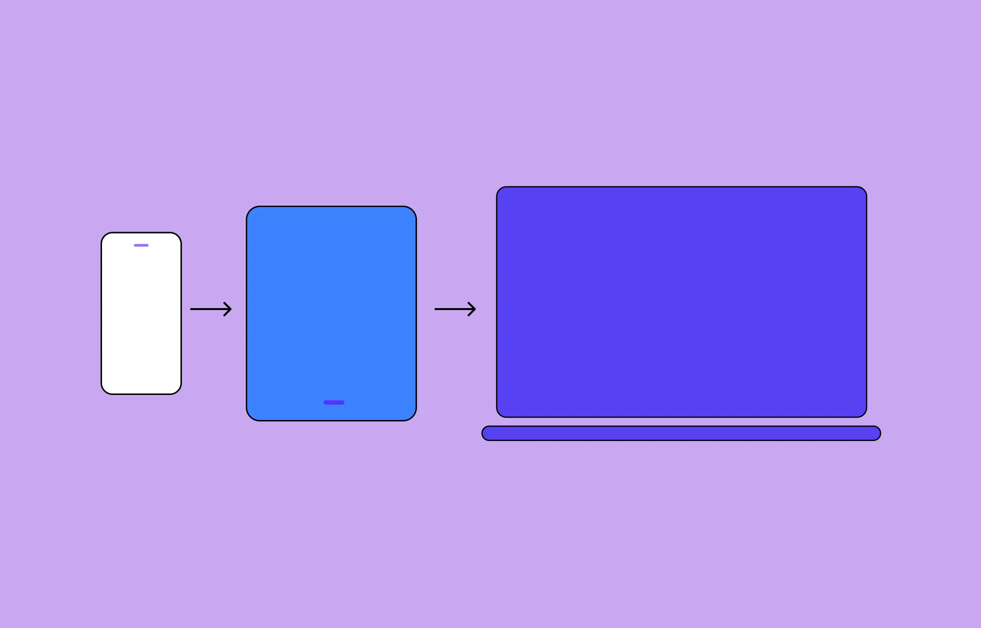
Unlimited Custom Breakpoints: Ensure you can tailor your web design to any screen size you desire, not just a few preset options, with the flexibility to work across as many breakpoints simultaneously as you need.
Side-by-Side Breakpoint Editing: Choose a website builder that lets you see and edit all your breakpoints at the same time, so you can manually optimize specific design elements for different screen sizes without switching modes.
Live Preview for All Devices: Make sure your website builder offers a live preview for all devices, allowing you to see how your design looks on different screen sizes in real time.
Granular Control and Extensive Customizability: Make sure your website builder offers granular control and extensive customizability, giving you the flexibility needed to make your website fully mobile-responsive.
Flexible Text and Image Sizing: Choose a website builder that supports relative sizing for text and images, allowing them to scale proportionally across different screen sizes for a consistent and polished look.
Where can you find a single website building platform with all of this and more? The answer is the Kirki WordPress Website Builder! Designed to offer all these capabilities in one platform, Kirki is the best website builder for creating responsive websites seamlessly, without the hassle of managing extra plugins.
Step 2: Start With a Mobile-First Design Approach
To create a truly accessible, mobile-friendly web design, it’s best to start with a mobile-first design approach.
This means designing your website for smaller screens like mobiles first and then working your way up to larger screens.
Why? Designing for larger screens first might lead you to fill the space with a lot of extra elements, making it challenging to downsize later for smaller screens. A mobile-first design ensures you prioritize the mobile experience right from the start and avoid the hassle of squeezing your design to fit.
With Kirki’s infinite canvas, all your breakpoints, Desktop, Tablet, Landscape, and Mobile, are visible side by side simultaneously. You can start designing on the Mobile view and instantly see how your design adapts across all other screen sizes in real time, making the mobile-first approach completely natural and effortless.
Step 3: Create Responsive Content
When designing your website, make sure to use flexible sizing so your content seamlessly adapts to any screen size including mobile phones.
For responsive design in Kirki, you can use relative sizing units such as Percentage (%) for images while using em or rem units for text. This ensures your content adjusts dynamically to different screen sizes, creating a truly responsive website design across all platforms.
Kirki also offers a Clamp option in the Advanced Typography panel, which lets you set a minimum, preferred, and maximum font size so your text scales fluidly across every device automatically.
Step 4: Manually Tailor Design for Different Screen Sizes

So you’ve implemented flexible design, but what if you need more precise control over certain aspects of your page?
This is where Adaptive Design comes in. It focuses on creating fixed layouts for specific screen sizes, giving you greater control over how content is displayed on particular viewports.
With Kirki, you can use the default preset breakpoints such as Desktop, Tablet, Landscape, and Mobile, or define unlimited custom breakpoints for any specific viewport you need. Since all breakpoints are visible side by side on the infinite canvas, switching between them is instant. Simply select the breakpoint view you want to refine and make your adjustments using Kirki’s extensive Design tab options and atomic-level granular control.
Step 5: Optimize for Speed and Performance

To truly craft a mobile-friendly website, you need to optimize for speed and performance.
Mobile screens are smaller, which means less room to display content. If a website takes too long to load, users get frustrated quickly. Mobile users also expect fast load times because they’re often on the go with less patience for slow websites, especially when using mobile data or slower networks.
Here’s how to optimize your website speed and performance in Kirki:
- Enable Image Optimization to automatically compress images without sacrificing quality
- Enable Lazy Loading for videos so they only load when they enter the viewport
- Use Kirki’s breakpoint-specific controls to minimize heavy animations on smaller screens
- Avoid third-party JavaScript libraries and CSS. Kirki itself doesn’t rely on these and auto-compresses any JavaScript and CSS, directly improving your site’s speed
For more on this topic, check out our article on the Top Tips to Increase Website Speed in WordPress!
Step 6: Test Responsiveness Across Devices
Once you’ve designed your website, it’s time to test its responsiveness across devices.
With Kirki’s infinite canvas, you can view a live preview of all breakpoints simultaneously while editing. You can also preview your page and resize the browser window to see how your design adapts in real time.
For additional testing, use tools like Browser DevTools, BrowserStack, Responsinator, or Testsigma to fully ensure your website looks and performs perfectly on all screen sizes.
Create Your Mobile-Friendly Website Today
That was our complete guide on how to craft a mobile-friendly website with no code!
With a one-stop platform like the Kirki WordPress website builder, the entire process becomes a breeze, giving you all the tools you need to create stunning, fully optimized designs for any device.
So what are you waiting for? Get Kirki today and design websites with seamless mobile responsiveness effortlessly!

