A cohesive design is the backbone of a visually stunning and seamless website experience. And thanks to global styles and no-code website builders, achieving that polished, professional look has never been easier.
So without further ado, dive into our in-depth guide and discover everything you need to know about how to style your site using global styles with no code, effortlessly!
What Are Global Styles in Web Design
Global styles in web design refer to predefined style attributes like fonts, sizes, colors, and more that apply consistently across your entire site. They eliminate the need for repetitive manual adjustments, ensuring a unified look and feel with minimal effort and fewer inconsistencies.
Now that you understand the concept of global styles in web design, it’s time to learn how to style your site using them. Here’s everything you need to know!
Choosing the Best Website Builder for Global Styling

To fully harness the power of global styles, the first step is choosing the right no-code website builder, one that offers flexibility and no restrictions in terms of cohesive website building capabilities.
Global styling in no-code website builders comes in various forms, so here’s a list of key features to look for to simplify your decision:
Ease of Use: Choose a builder with an intuitive drag-and-drop interface, making global styling effortless and user-friendly.
Real-time Previews: Opt for a tool with real-time previews to instantly see your cohesive design take shape as you craft it.
Centralized Dashboard: Look for a no-code website builder with a central dashboard to define, manage, and edit all your global styles from one place.
Cross-Page Design Consistency: Ensure your chosen builder applies global styling consistently across all pages automatically.
Style Variations: Bonus points if your website builder lets you define multiple global style variations, allowing you to switch between looks and custom themes quickly and consistently.
Scalability: As your website grows, you may need more global styles. Choose a tool that lets you define unlimited global styles.
Looking at this list, one no-code website builder that checks every box is Kirki. With its intuitive drag-and-drop interface and powerful global styling functionality called Variables, Kirki gives you everything you need to design cohesive websites effortlessly!
Using Kirki Variables for Global Styling
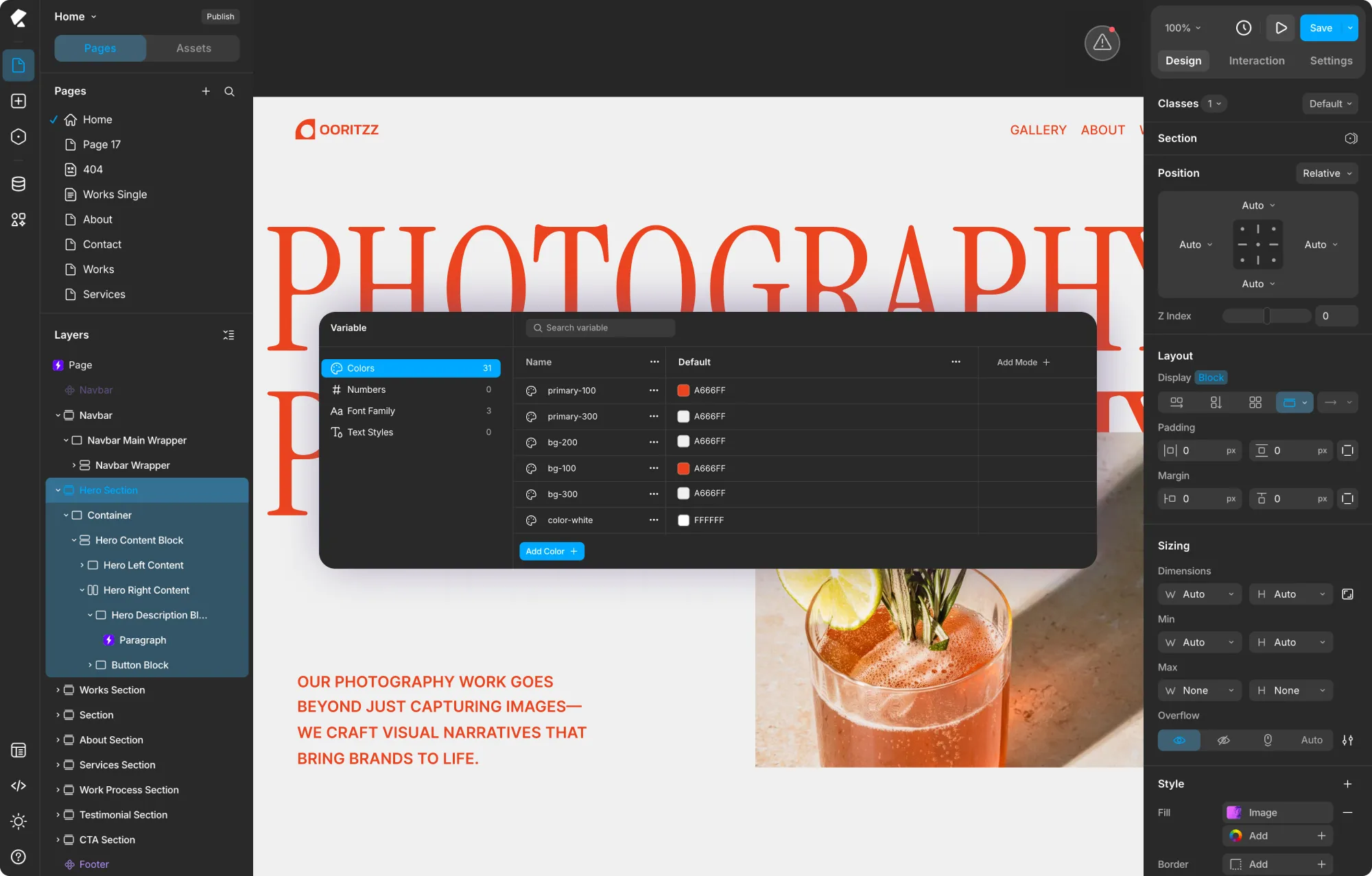
The Variable panel in Kirki is your central hub for defining and managing all global styles. Access it by clicking the Variable icon in the left sidebar.
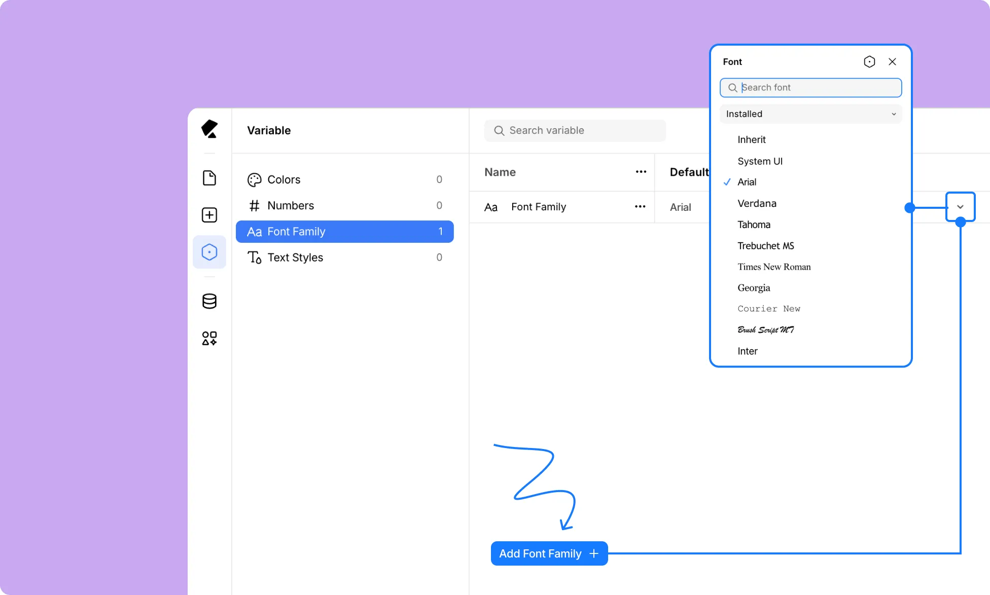
Inside, you’ll find four categories of Variables:
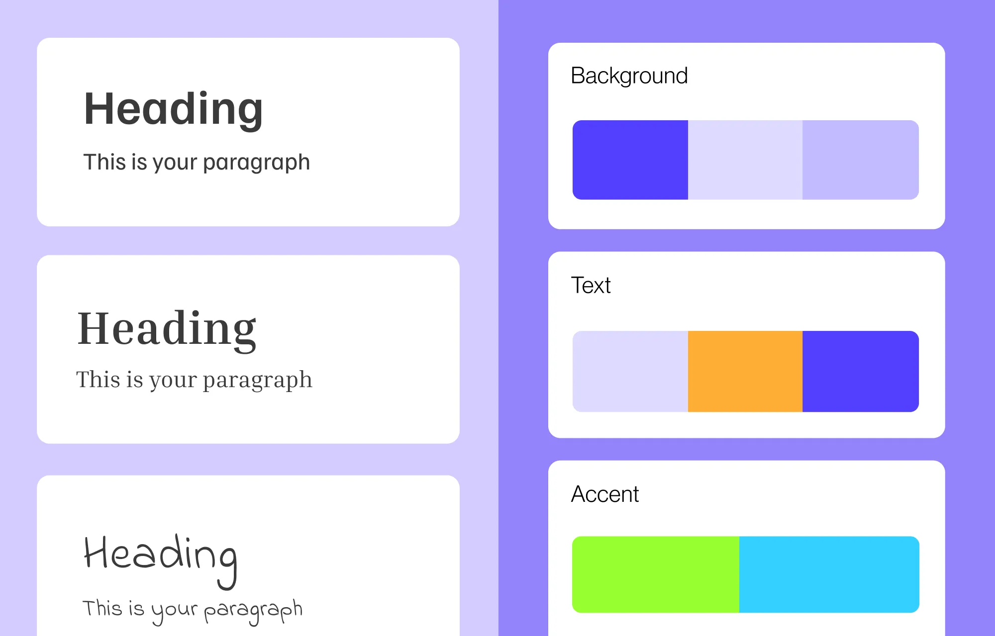
Colors: Define reusable color values and apply them to any color field across your site, from backgrounds and fills to text colors, borders, gradient stops, and more.
Numbers: Define reusable numeric values to keep your spacing, sizing, and other numeric properties consistent and easy to update everywhere.
Font Family: Define reusable font families that appear directly in the font picker alongside system and Google fonts, making it easy to apply your brand fonts consistently across all text elements.
Text Styles: Define complete text style presets combining font, size, weight, and other typography settings for instant, consistent text styling across your site.
Kirki also lets you define multiple Modes for each group of Variables, allowing you to create custom themes and variations that you can instantly switch between to update your entire website’s look with a single click.
Defining Your Global Styles
Once you’re in the Variable panel, here’s how to define each type of Variable:
Adding a Color Variable
Click Colors in the left panel of the Variable dashboard, then click Add Color + at the bottom. Give your color a meaningful name, set its hex value, and it will appear in the color picker across your entire site.
Adding a Number Variable
Click Numbers in the left panel, then click Add Number +. Give it a name, set its value, and choose a unit such as px. This variable can then be applied to any numeric field like width, height, padding, margin, and more.
Adding a Font Family Variable
Click Font Family in the left panel. Add a new font family variable and assign it a name like “Primary Font” or “Secondary Font.” These will then appear at the bottom of the font picker whenever you select a font for any text element.
Adding Variable Modes
To create alternate style variations or custom themes, click Add Mode + at the top right of the Variable dashboard. A new column will appear next to Default. Give your mode a meaningful name and edit the values for each Variable in that mode column as needed.
You can create as many modes as you like, making it easy to maintain multiple visual themes for your website.
Applying Your Global Variables
Once your Variables are defined, here’s how to apply them across your site:
Applying a Color Variable
Select any element on the canvas and open the Design tab. Click the color swatch next to any color field, such as Fill, Border, or Text color. In the color picker, you’ll find your defined Color Variables listed. Click one to apply it.
Applying a Font Family Variable
Select a text element and go to the Typography section in the Design tab. Click the font name to open the Font picker. At the bottom of the font list, you’ll see your Font Family Variables listed. Click one to apply it to your element.
Applying a Number Variable
Select any element and click the Variable icon next to any numeric field in the Design tab, such as Width, Height, Padding, or Margin. Select the Number Variable you want to apply.
Switching Between Modes
To switch between Variable modes on a specific section:
From a Structure Element: Select any structure element like a Section, Container, Div, or Stack on the canvas. In the Design tab, click the Variable icon next to the element’s name. A dropdown will appear showing Inherit, Default, and any custom modes you’ve created. Select the mode you want to apply to that element.
Note: Set structure element modes to Inherit for the page-wide Variable mode to take full effect. To prioritize a structure-level mode over the page-wide one, set the page mode to Inherit instead.
With a single click, you can instantly switch up the look of any page or section using Kirki’s Variable modes!
Unlinking Global Styles
To remove a Variable from a specific field, simply click the broken link icon next to the field to unlink it. The field will revert to a manual value while all other instances of that Variable remain unaffected.
Updating Your Global Styles
You’ve set up your Variables and applied them across your site. Now, you want to tweak one of your global attributes. Do you need to go through every element and update it manually?
Absolutely not! Just open the Variable panel from the left sidebar, find the Variable you want to update, and change its value. Watch the change instantly reflect across your entire website everywhere that Variable was applied.
This makes iterating on your design, testing new color palettes, or rolling out a brand refresh completely effortless.
Tip: Plan your Variables before building your website and assign them as you go for maximum efficiency.
💡Tip: Plan your Variables before building your website and assign them as you go for maximum efficiency.
Key Benefits of Using Global Styles
Now you know how to style your site using global styles with Kirki’s Variable system! But why should you use them in the first place?
Global styles don’t just make cohesive design easier — they completely streamline your entire website building process, resulting in many positive outcomes:
Design Consistency Across the Site: Set fonts, sizes, and colors once, apply them everywhere, and avoid inconsistencies while saving significant time.
Faster Website Building: Apply a global style instead of manually matching your design everywhere, making the website building process faster and more efficient.
Effortless Updates: Change a Variable’s value once and watch it automatically update everywhere across your site instantly.
Elevated Website Building Experience: With effortless design consistency and seamless updates, elevate your entire website building experience to new heights.
Simplified Collaboration: If your website is a team effort, global styles ensure consistency and eliminate confusion across collaborators. Combined with Kirki’s built-in real-time collaboration and comments, maintaining a cohesive design as a team has never been simpler.
Cohesive Web Design Simplified
Using Kirki’s Variable system, you can easily define and apply reusable global styles in WordPress, making cohesive website design truly effortless.
Create custom text styles with Font Family and Text Style Variables, build cohesive color palettes with Color Variables, maintain consistent spacing and sizing with Number Variables, and switch between entire visual themes with a single click using Modes.
And beyond Variables, Kirki is packed with powerful built-in features including a Dynamic Content Manager, Figma to Kirki tool, Visual Interaction Builder, pre-made sections and templates, real-time collaboration, and much more.
So why wait? Get the Kirki WordPress website builder today and style your site using global styles with no code!