Grids & Layouts
Structure precisely. When you need it.
CSS Grid and Flexbox built directly into the canvas. Create any layout — from simple to complex structure.


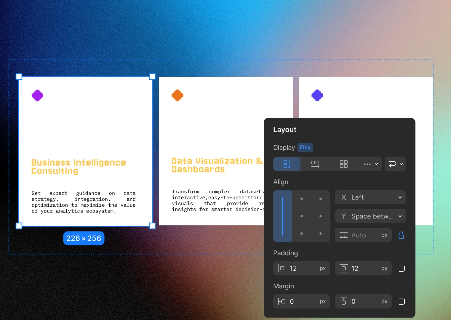
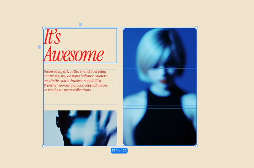
Put anything, exactly where you want it.
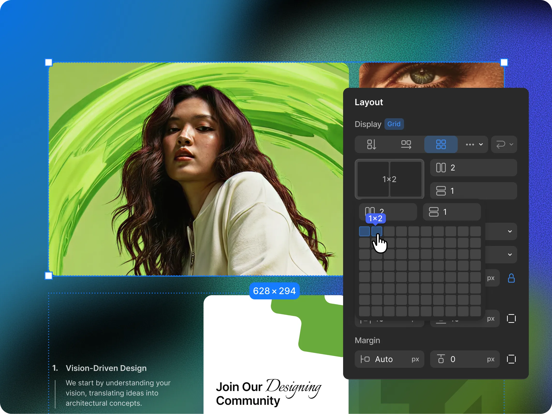
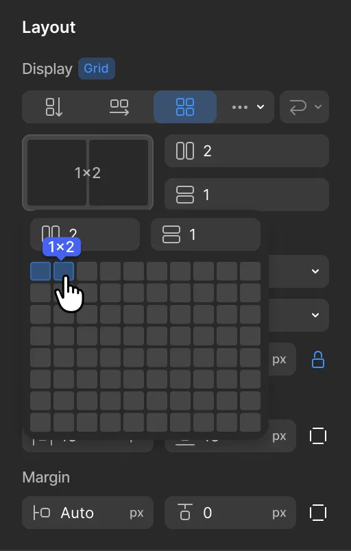
Full control over how elements sit inside a grid — alignment, area, spacing, and density. Designed visually, not coded manually.
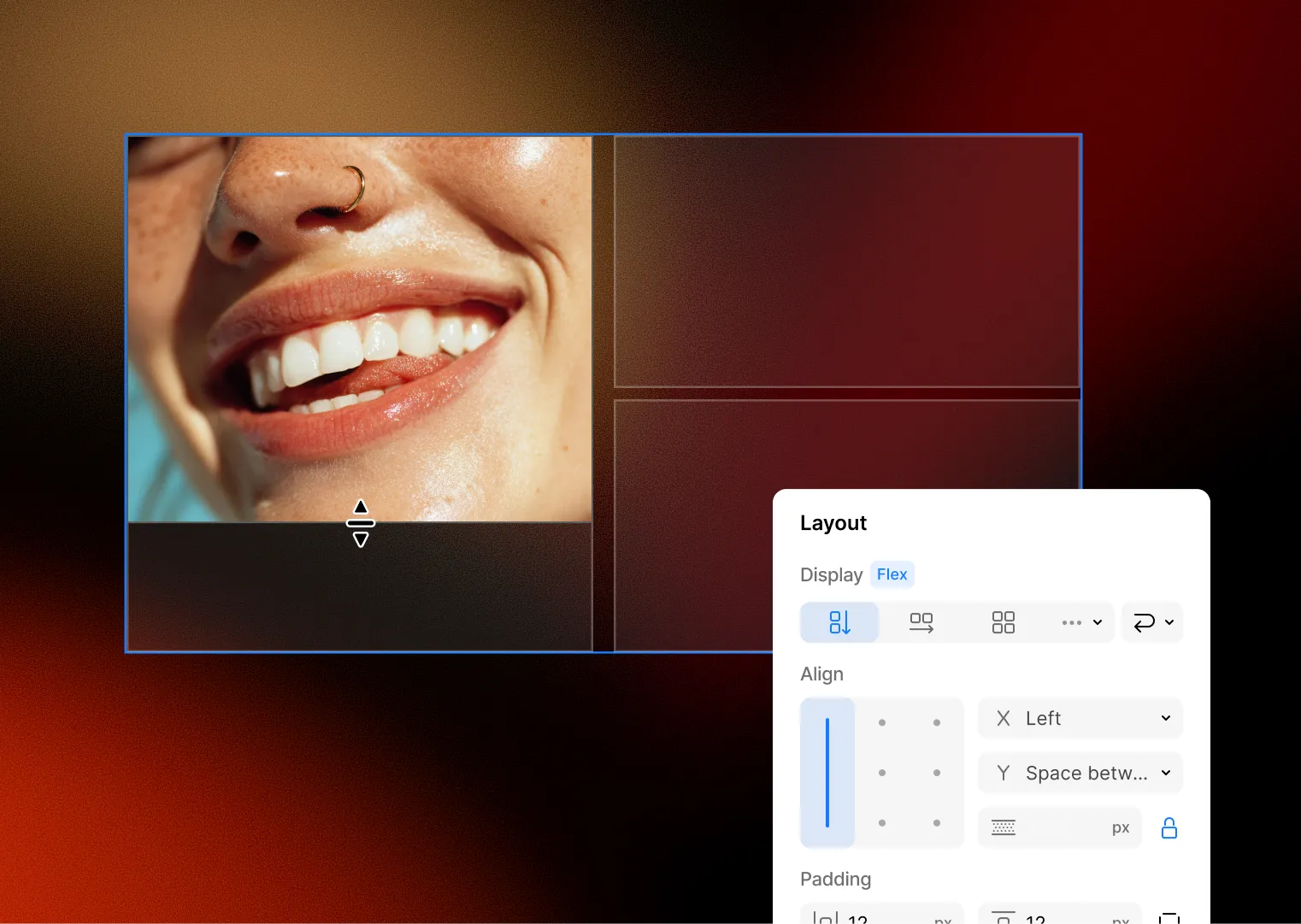
Align elements horizontally and vertically
Perfectly place flex elements by adjusting vertical and horizontal alignment
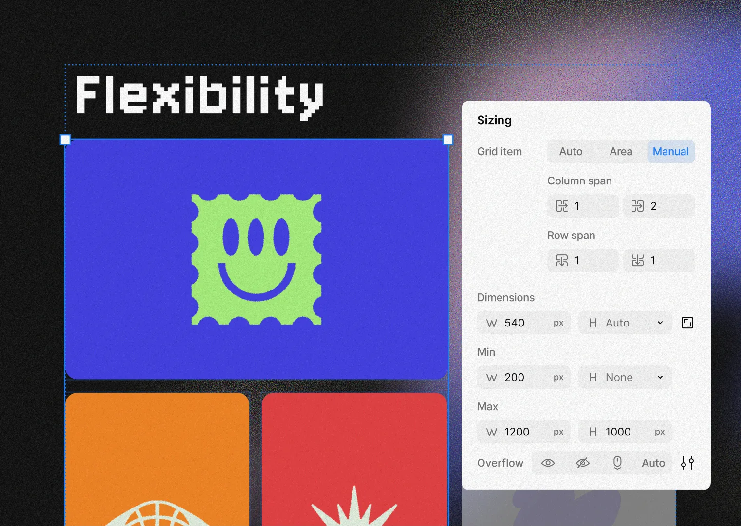
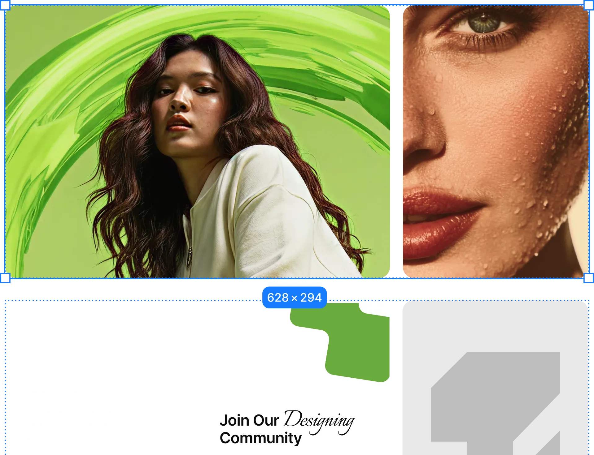
Span elements across multiple cells
Span your grid items across multiple cells by assigning it a grid area.
Control how each item behaves independently
Individually customize each grid item’s alignment, order, & placement
Pack items tightly or space them freely
Visually manage every aspect of your grid’s layout & its grid items


Responsive.
Without the extra work.
Every grid you build adapts automatically across desktop, tablet, and mobile. Set your layout once — Kirki handles the breakpoints.


Every grid detail. Under your control
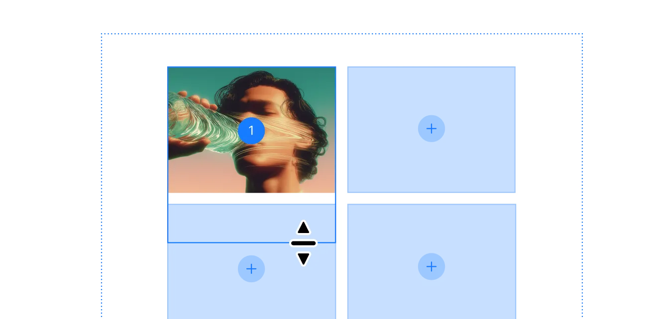
Build your grid visually
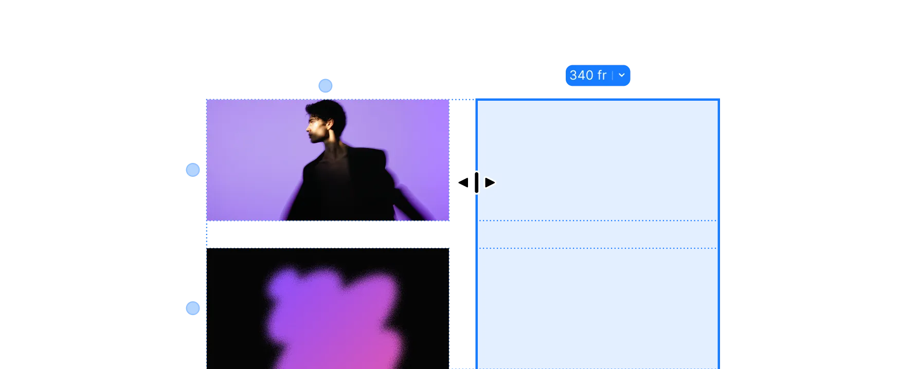
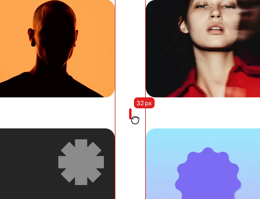
Space columns and rows exactly right
Name areas, place elements anywhere
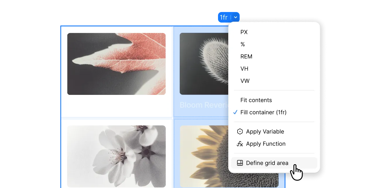
Span elements across multiple tracks
Everything you need.
Nothing you don't.
Grid & Layouts
Harness the power of grid and flex elements to create stunning, responsive layouts effortlessly for your website.
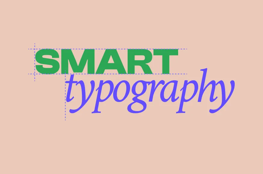
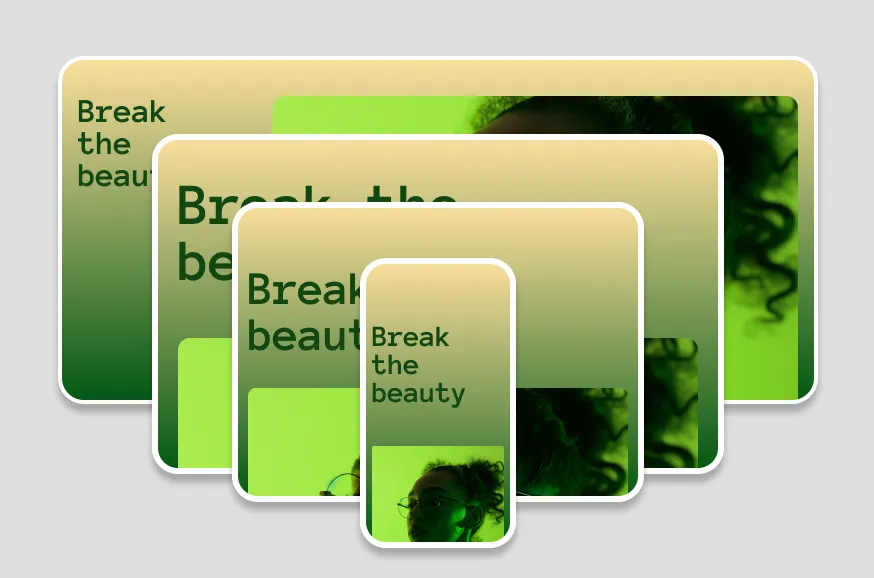
Advanced Typography
Style typography in many ways to create eye-catching visuals.
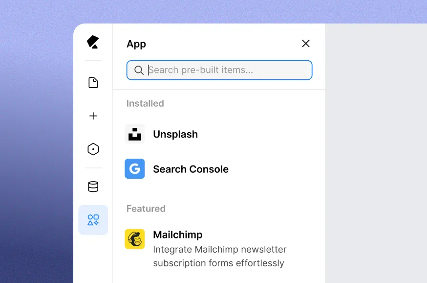
Get essential app integrations
20+ built-in apps from Mailchimp to Google Search Console — no third-party setup.
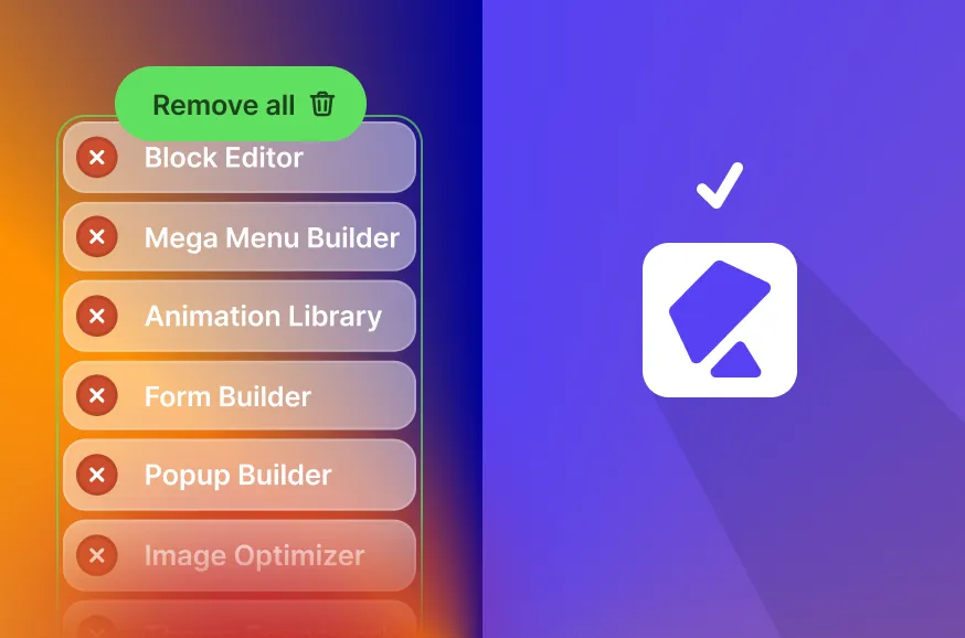
Get rid of third-party plugins
Forms, popups, maps, SEO, icons — all built in. Fewer plugins, faster sites, fewer vulnerabilities.
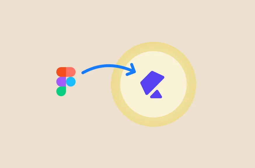
Figma to Kirki
Import Figma designs directly — preserving your styles, spacing, and layouts exactly as designed.
Create unlimited breakpoints
Less plugin reliance means fewer conflicts, better performance, and a smoother experience—without the WordPress plugin chaos.