This guide covers how to create, use, edit, and manage Components in Kirki, including how to use Fields to make individual instances editable without detaching them.
What Is a Component
A Component is a reusable block built from any element and its child elements. Once created, it’s saved to your Assets panel, ready to reuse anywhere on your site.
Perfect for repeating sections like headers, footers, or CTAs, Components help maintain consistency across your site while simplifying updates. Edit the main Component once, and every instance of it updates automatically.
With Fields, you can also set what’s editable for individual instances, so text, images, or links can be changed without risking the design.
How to Create a Component
Here’s how to create a component:
From the Left Sidebar
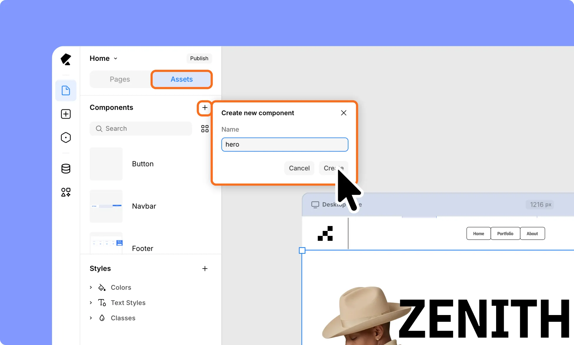
- Select the element or group of elements.
- From the Left Sidebar, go to Pages → Assets.
- Under Components, click the plus (+) icon.
- In the Create New Component dialog, enter a name for your Component.
- Click Create.
From the Canvas
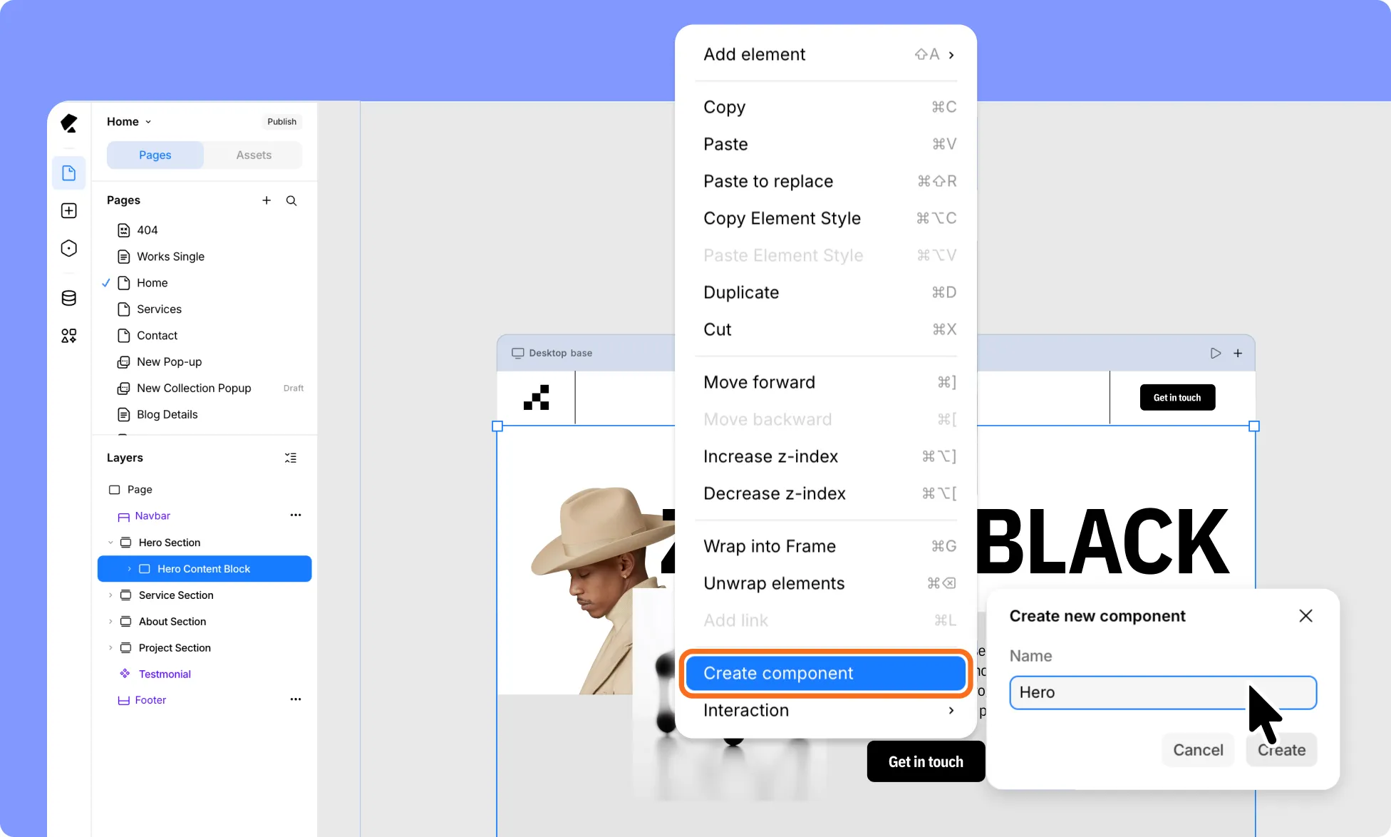
- Right-click on the element or group of elements.
- Select Create Component.
- In the Create New Component dialog, enter a name for your Component.
- Click Create.
Your new Component will now appear in the Components section, ready for reuse.
How to Use Components
Here’s how you can use Components across your site:
- From the Left Sidebar, go to the Pages panel.
- Switch to the Assets tab.
- From the Components section, drag and drop any Component onto the canvas.
How to Edit a Component
Editing a Component updates its main instance, so changes automatically apply everywhere it’s used across your site.
- Select the component on the page to access its settings.
- Click Edit Component from the Design tab in the Right Panel.
- Alternatively, double-click the Component directly on the canvas, or go to the Left Sidebar → Pages → Assets tab, click the ellipsis (…) icon next to your component, and select Edit.
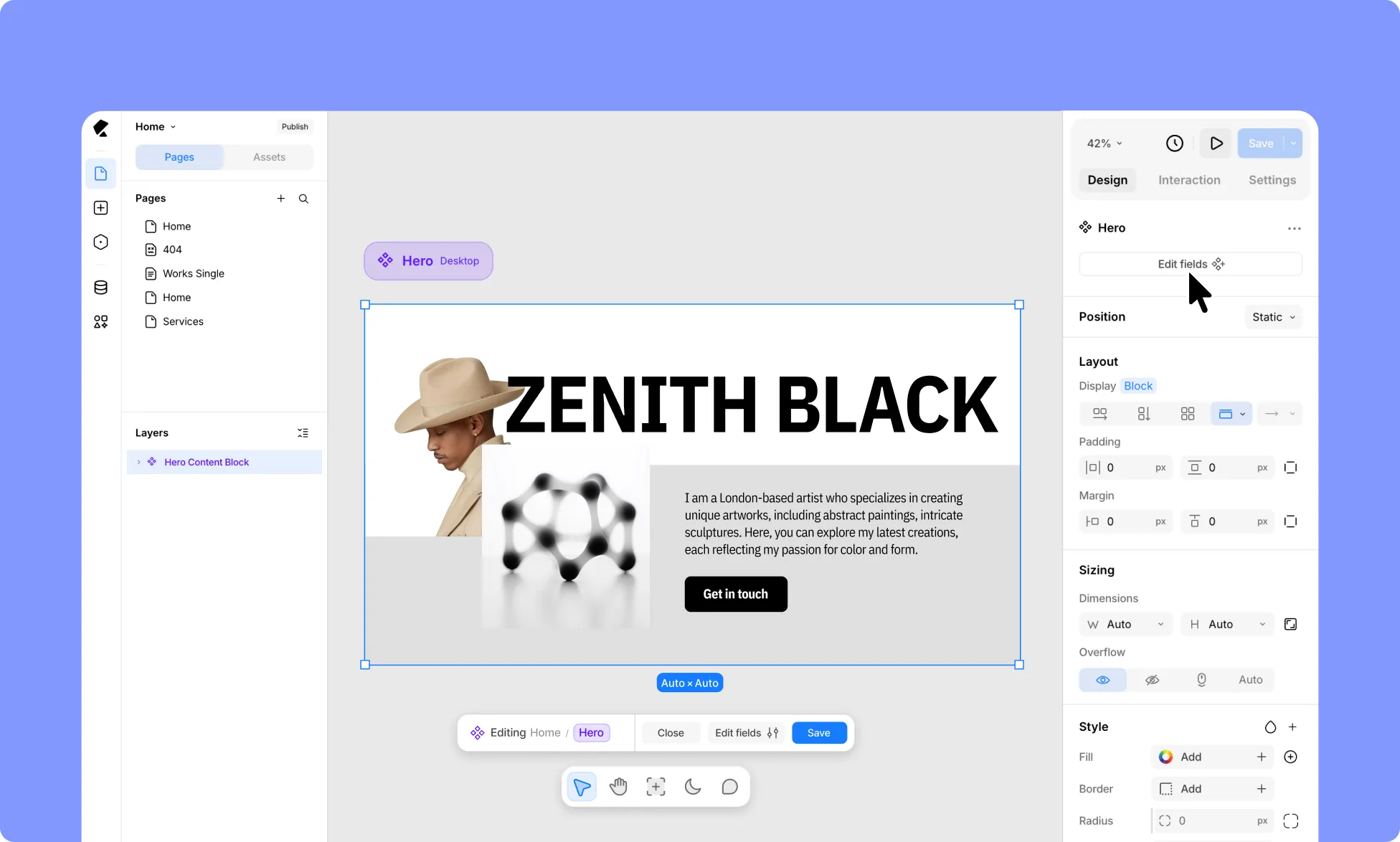
- This opens the Component in edit mode, where you can see and edit its structure, design, and content – all of it across each breakpoint, shown side by side on the canvas.
- Once you’ve made your changes, click Save at the bottom of the screen to apply them, or click Cancel to discard them.
Nested Components
What Are Nested Components
A Nested Component is a Component used inside another Component. For example, a button component can be used inside a section that’s turned into its own Component.
Even nested, the button stays a full Component in its own right and can still be reused on its own outside the section.
This lets you reuse smaller components inside bigger ones, instead of rebuilding the same elements every time.
How to Create Nested Components
- Build the element you want to reuse (for example, a button), then turn it into a Component (see How to Create a Component).
- Use that Component inside another section.
- Turn that section into a Component too. The nested Component stays a Component in its own right – editable and reusable on its own, or wherever it’s nested.
How to Edit Nested Components
- Open the parent Component in edit mode.
- Select the nested Component and enter its edit mode.
- A breadcrumb in the bottom bar shows which level you’re working on, so you can tell whether you’re editing the parent or the nested Component.
- Make your changes, then click Save to apply them, or Cancel to discard them.
Component Fields
What Are Component Fields
Fields let you connect an element inside a Component (like a text, image, or button element) to an editable input. Once connected, you can update that instance’s content or fill directly from the canvas, without detaching the Component or affecting other instances.
How to Create Component Fields
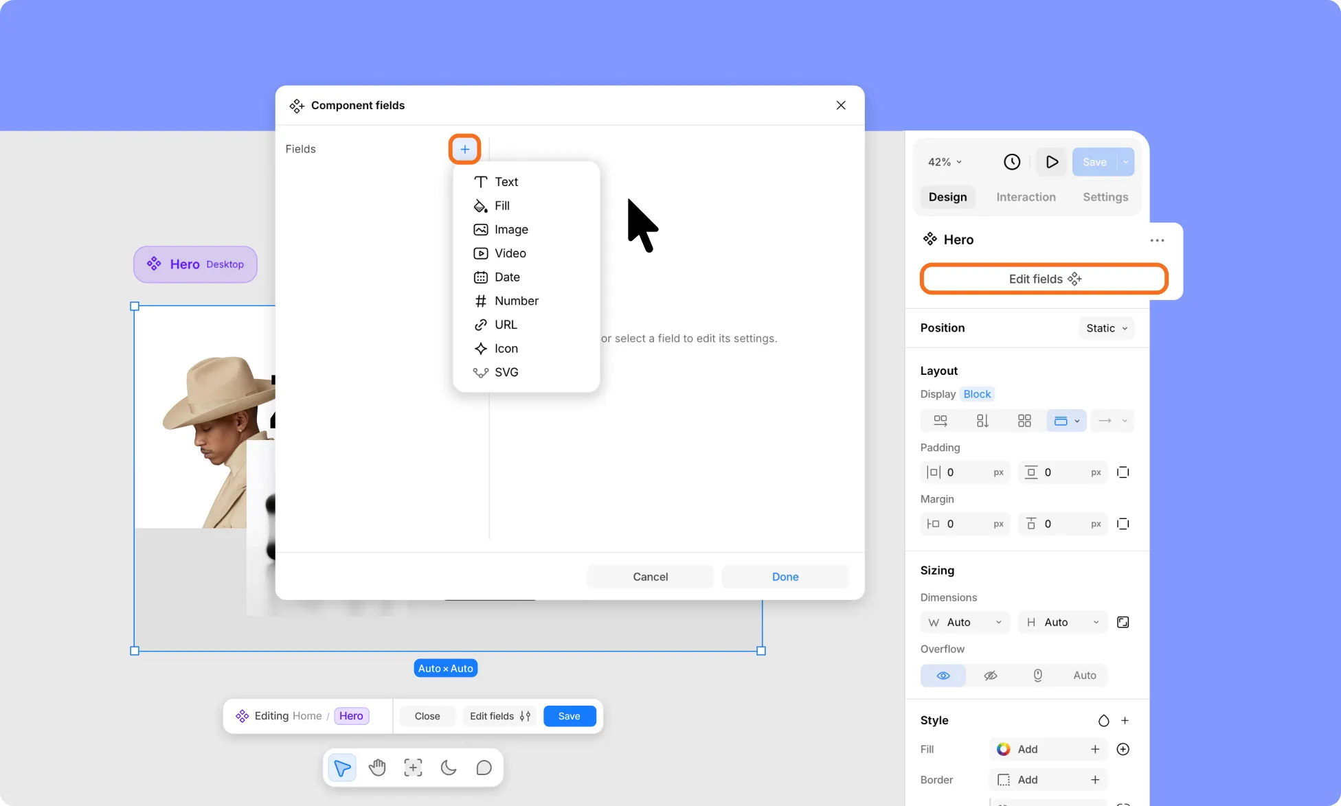
To create a Component Field:
- Open your Component in edit mode.
- Click Edit Fields at the bottom of the screen or in the Right Panel.
- In the Component Fields editor, click the plus (+) icon next to Fields.
- Choose a field type:
- Text
- Fill
- Image
- Video
- Date
- Number
- URL
- Icon
- SVG
- Name the field, add optional help text, set a default value if needed, and toggle Required if it must be filled in.
- Click Done to save, or Cancel to discard.
Repeat for each field you want to add – they’ll appear in the Fields list on the left of the window.
How to Connect Fields to an Element in a Component
How you connect a field depends on the field type: content, URL, or a background fill. Pick the flow that matches your field type below.
How to Connect a Text, Image, Video, Date, Number, URL, Icon, or SVG Field
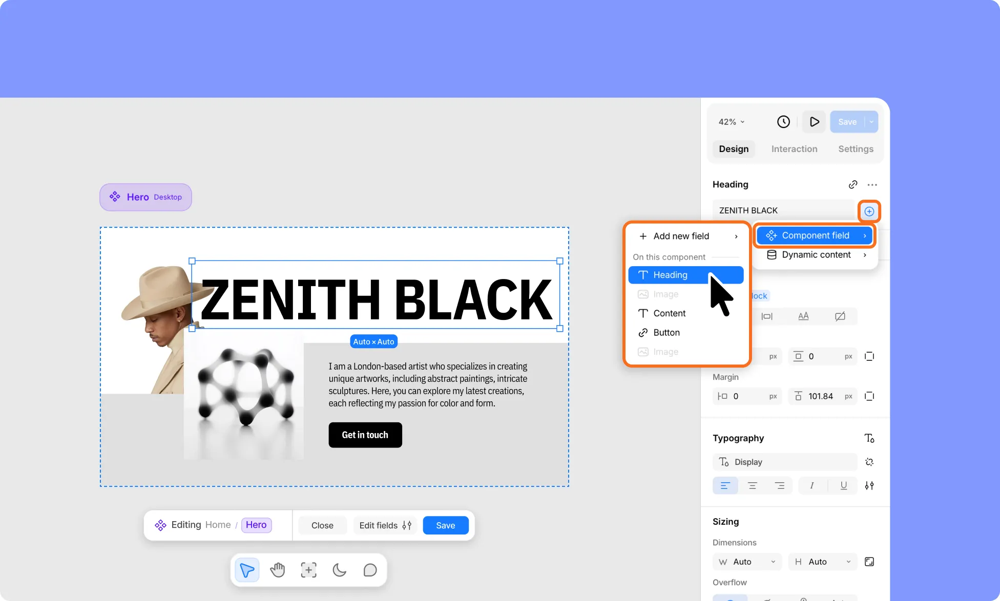
The following steps work the same way for Text, Image, Video, Date, Number, URL, Icon, and SVG fields, since they can all connect through the element’s content:
- Open your Component in edit mode.
- Select any text, media, or button element you want to connect.
- In the Right Panel, click the plus (+) icon next to that element’s input field.
- From the menu, select Component Field and choose the field to connect.
- Click Save at the bottom of the screen to apply your changes and exit edit mode.
How to Connect a URL Field From Link Settings
You can also connect URL fields from an element’s link settings instead:
- Open your Component in edit mode.
- Select an element that can be linked (for example, a button’s text).
- In the Right Panel, click the link icon next to that element’s name.
- From the menu, choose Component Field, then select the URL field to connect.
- Click Save at the bottom of the screen to apply your changes and exit edit mode.
How to Connect a Fill Field
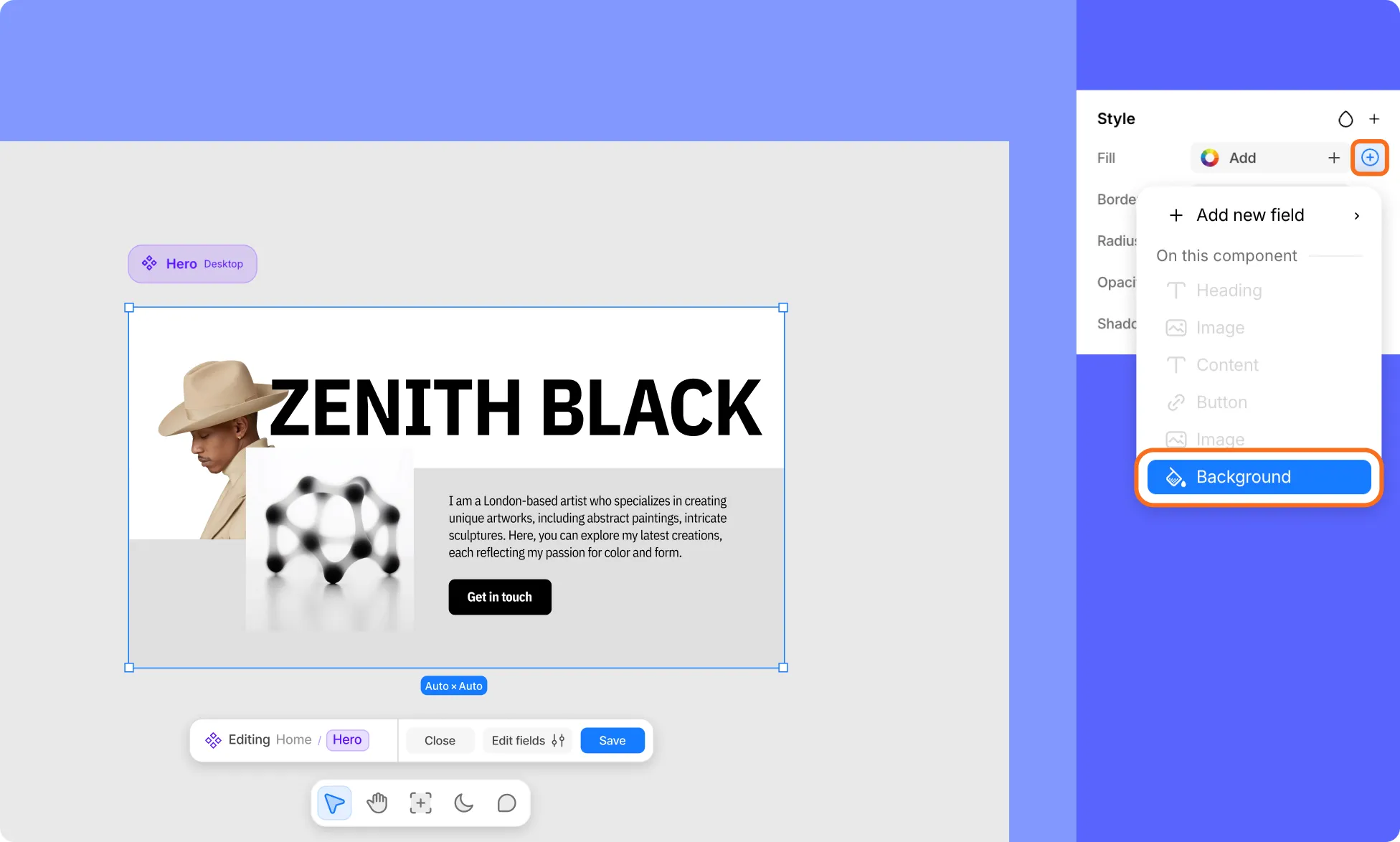
Similarly, Fill fields are connected from an element’s Style settings instead:
- Open your Component in edit mode.
- Select the element whose background you want to connect (for example, your component’s parent wrapper).
- In the Right Panel, go to Style → Fill, and click the plus (+) icon.
- From the menu, choose the Fill field to connect.
- Click Save at the bottom of the screen to apply your changes and exit edit mode.
Only fields that match the element’s content type and aren’t already linked elsewhere are selectable; incompatible or already-used fields appear grayed out.
And if you haven’t created a matching field yet, you can select Add New field from the same menu to create one on the spot.
Elements you don’t connect to a field stay tied to the main Component and can’t be edited per instance without detaching.
How to Delete Fields in a Component
- Open your Component in edit mode.
- Click Edit Fields at the bottom of the screen or in the Right Panel.
- In the Component fields dialog, find the field you want to remove in the Fields list.
- Click the ellipsis (…) icon next to that field, then select Delete.
- Click Done to save your changes, or Cancel to discard them.
How to Rename a Component
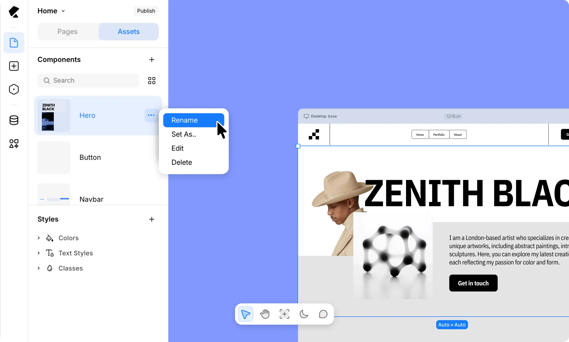
- From the Left Sidebar, go to Pages → Assets.
- In the Components section, click the ellipsis (…) icon next to any Component.
- Select Rename from the dropdown.
- Type the new name.
- Click anywhere or press Enter to save your changes.
How to Delete a Component
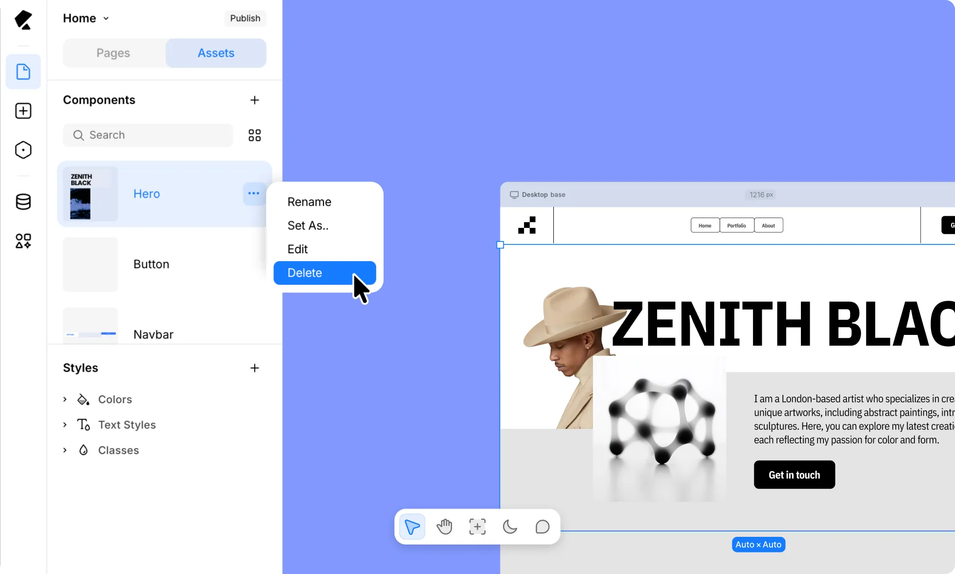
- From the Left Sidebar, go to Pages → Assets.
- In the Components section, click the ellipsis (…) icon next to any Component.
- Select Delete from the dropdown.
- A confirmation dialog will appear. Click Confirm to go ahead, or Cancel to keep the Component.
How to Set a Component as a Header or Footer
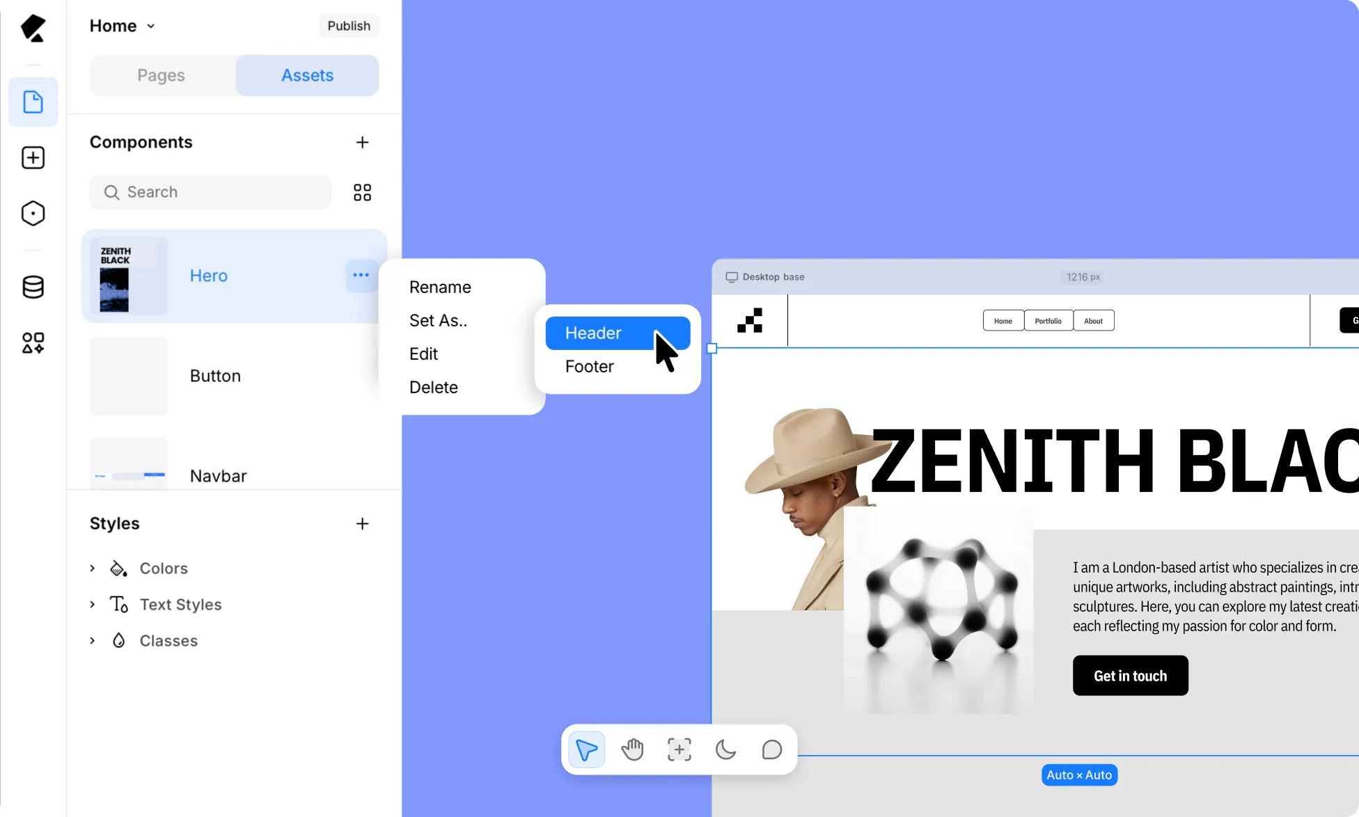
You can also set a Component as your site’s Header or Footer, so it automatically appears across every page.
Learn more about Headers and Footers.