Icons are a simple yet powerful way to enhance your website’s visual communication. They’re also an SVG file format with all the benefits that come with it.
Using the Icon element in Kirki, you can quickly add scalable, crisp icons from a wide selection of Icon Sets and customize their appearance to match your design.
Add Icon
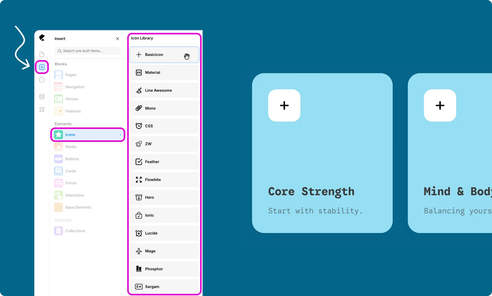
To add an Icon element to your page:
- Open the Insert panel from the Left Sidebar.
- Select Icons from the Elements section.
- Click or drag the Icon Set you want to use onto the canvas.
- The Icon element will show the first icon in that set by default.
Replace Icon
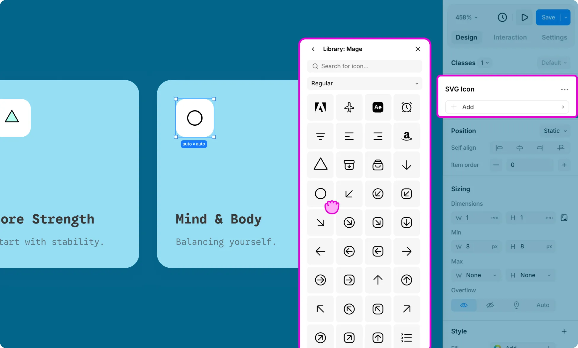
Once an icon is placed on the canvas, you can change which icon displays from the Design tab:
- Select the Icon element on the canvas.
- From the Design tab on the Right Panel, click on the Icon name.
- This will open the Icon Library, where you can browse the set or search for the icon you want.
- Click on your choice of icon to add it.
Icon Color
To change an Icon’s color:
- Select the icon element on the canvas.
- Under the Design tab in the Right Panel, click the plus (+) icon to add a new style property.
- Select Color from the dropdown.
Click the color swatch to open the color picker and choose your color.