A Navigation element helps users quickly and efficiently find their way around your website through a structured set of links.
In Kirki, the Navigation element is flexible and comes ready to customize to match your site’s design.
Why Use Navigation
Navigation helps users find their destination easily on any website. Through links and sub-links listed on a Navbar, they can quickly visit their target page without needing to remember its URL. Of course, for a Navbar to be helpful, it needs to be well-designed.
What Makes a Well-Designed Navigation
A user-friendly Navbar is one of the main factors that lead to a website’s success, so keep that in mind when designing your own. A good Navbar combines many things like choosing the most helpful links, having simple text, keeping a consistent and noticeable style, and more.
In essence, you need to think hard about what would help your users the most and design it with this in mind.
How to Add Navigation
There are two ways to add a Navigation element to your page:
From Premade Blocks
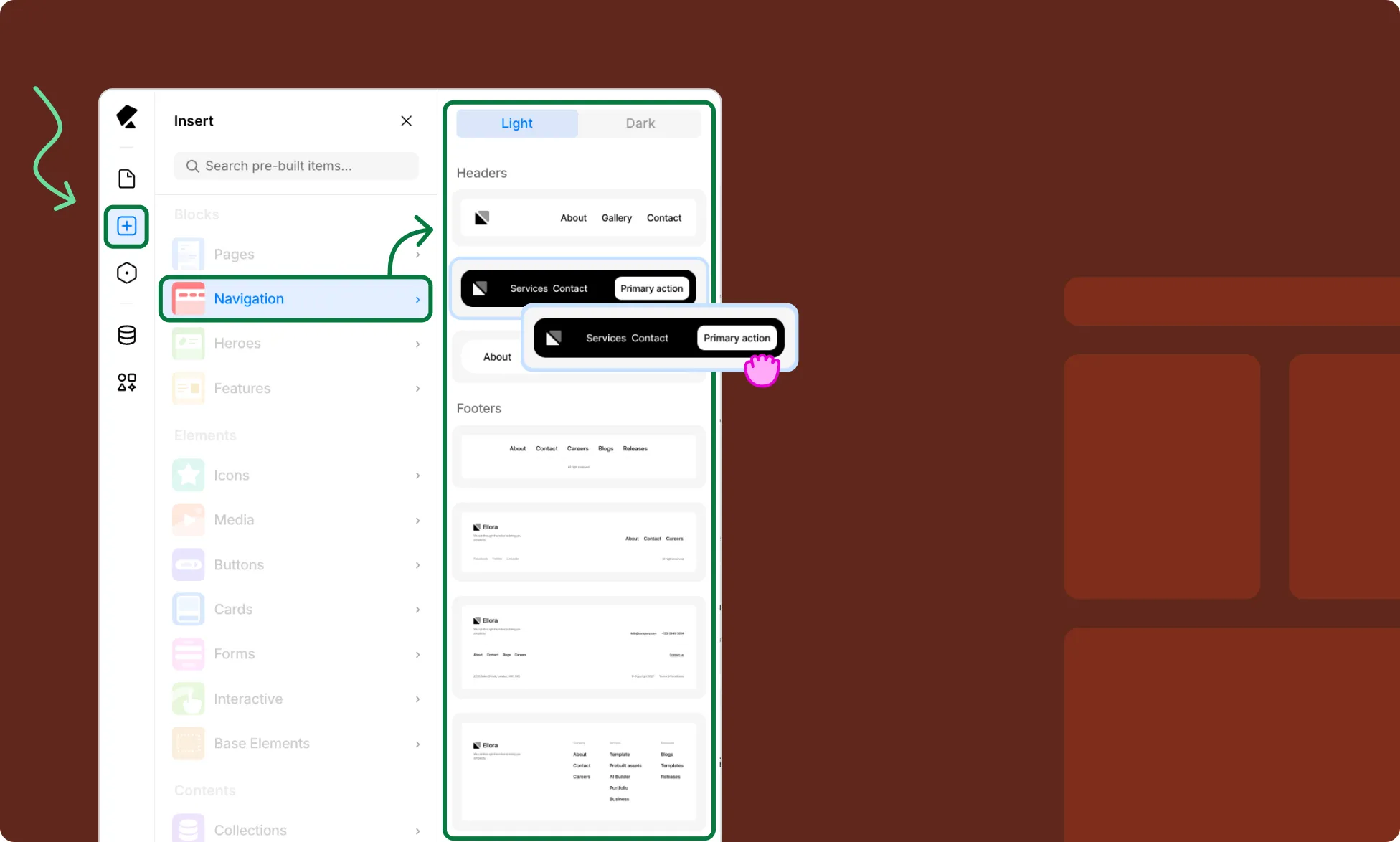
Kirki offers a few different premade Navigation options, which you’ll find under Blocks.
- Open the Insert panel from the Left Sidebar.
- Select Navigation from the Blocks section.
- Browse the premade Headers in Light and Dark variants.
- Click or drag your preferred design onto the canvas.
From Base Elements
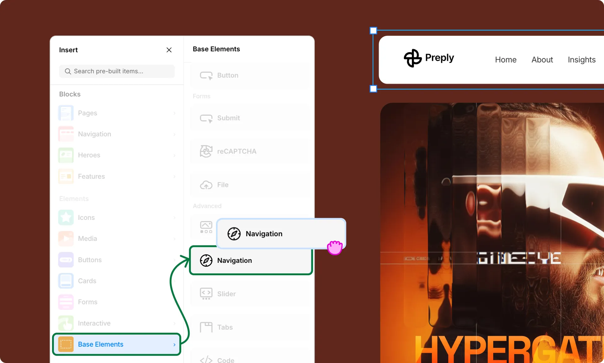
Alternatively, if you want just the core Navigation element without the structure or styling, you can add it from Base Elements.
- Open the Insert panel from the Left Sidebar.
- Select Base Elements from the Elements section.
- Scroll down to the Advanced section and click or drag the Navigation element onto the canvas.
📝 Note: If you don’t see Base Elements, click on the Kirki logo at the top-left to access the main menu, go to View, and enable Show Base Elements.
Navigation Structure
A premade navigation typically includes the following child elements, visible in the Layers panel:
- Logo – If you go for a premade Block, it usually includes a brand mark or site name on the left side of the navigation.
- Nav Items – The core part of every Navigation element, whether you’re using a premade Block or a base element. It consists of a list of link blocks used for site navigation. By default, it includes 5 link blocks covering the standard pages of a typical website, but you can fully customize them to match your own site structure and content.
- Navigation Button – Some Premade Blocks also have a call-to-action button within the navigation.
How to Add or Remove Navigation Items
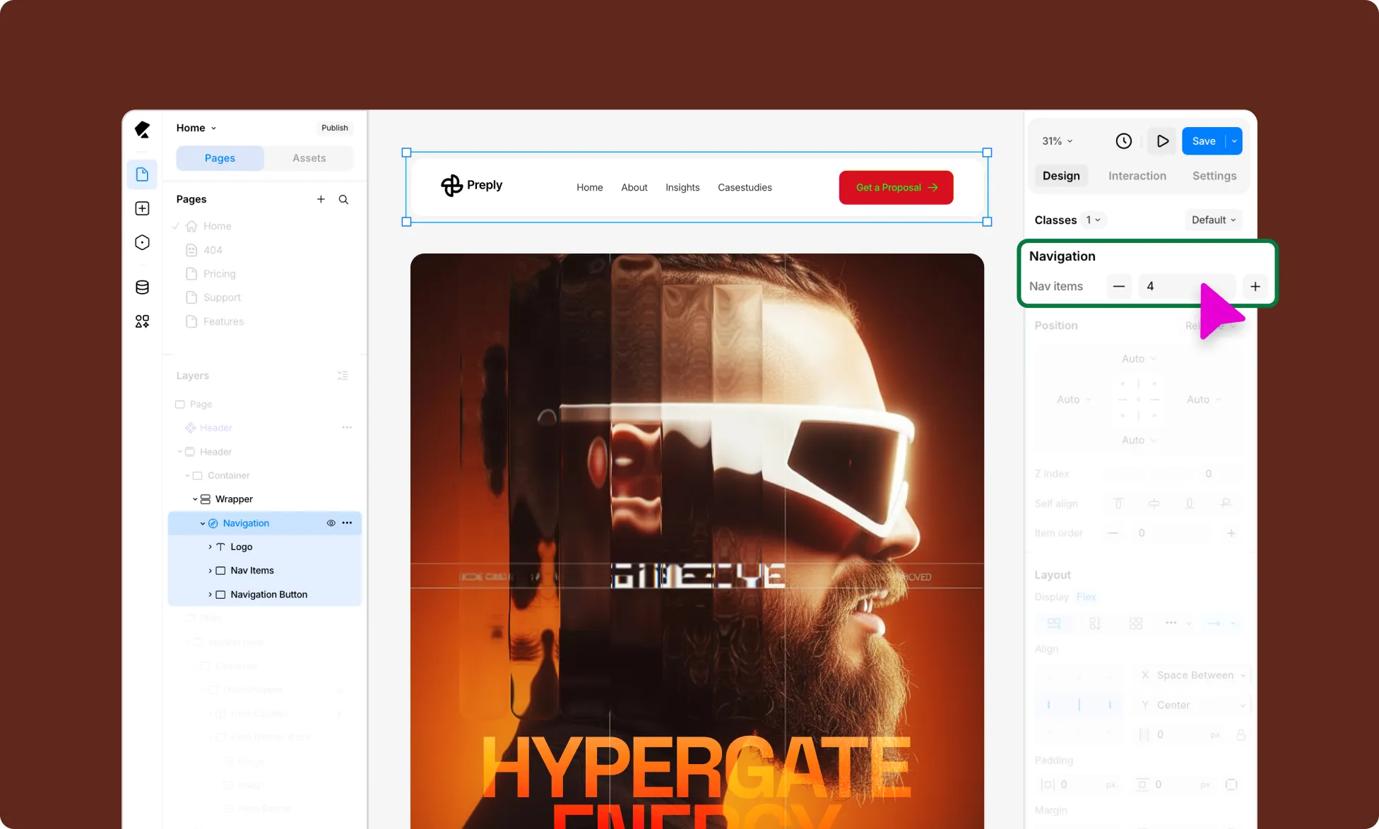
To add or remove navigation items:
- Select the Navigation element on the canvas.
- From the Design tab on the Right Panel, click the + and – buttons under Navigation to add or remove Nav Items. You can also directly type a number into the field to set the count.
How to Link Navigation Items
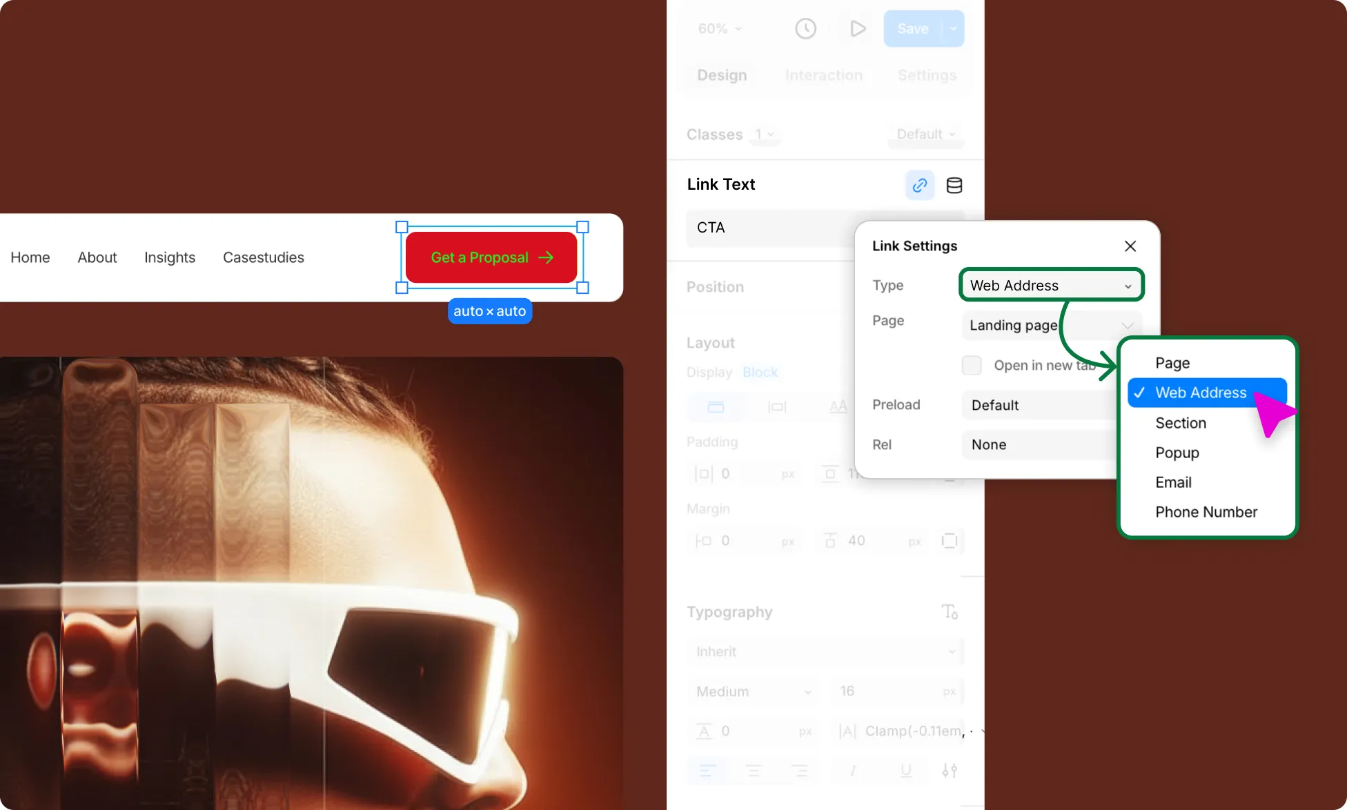
Nav items are essentially links. Here’s how to set the destination for each one:
- Select the Nav Item’s Link Text you want to configure.
- From the Design tab on the Right Panel, click the link icon under Link Text.
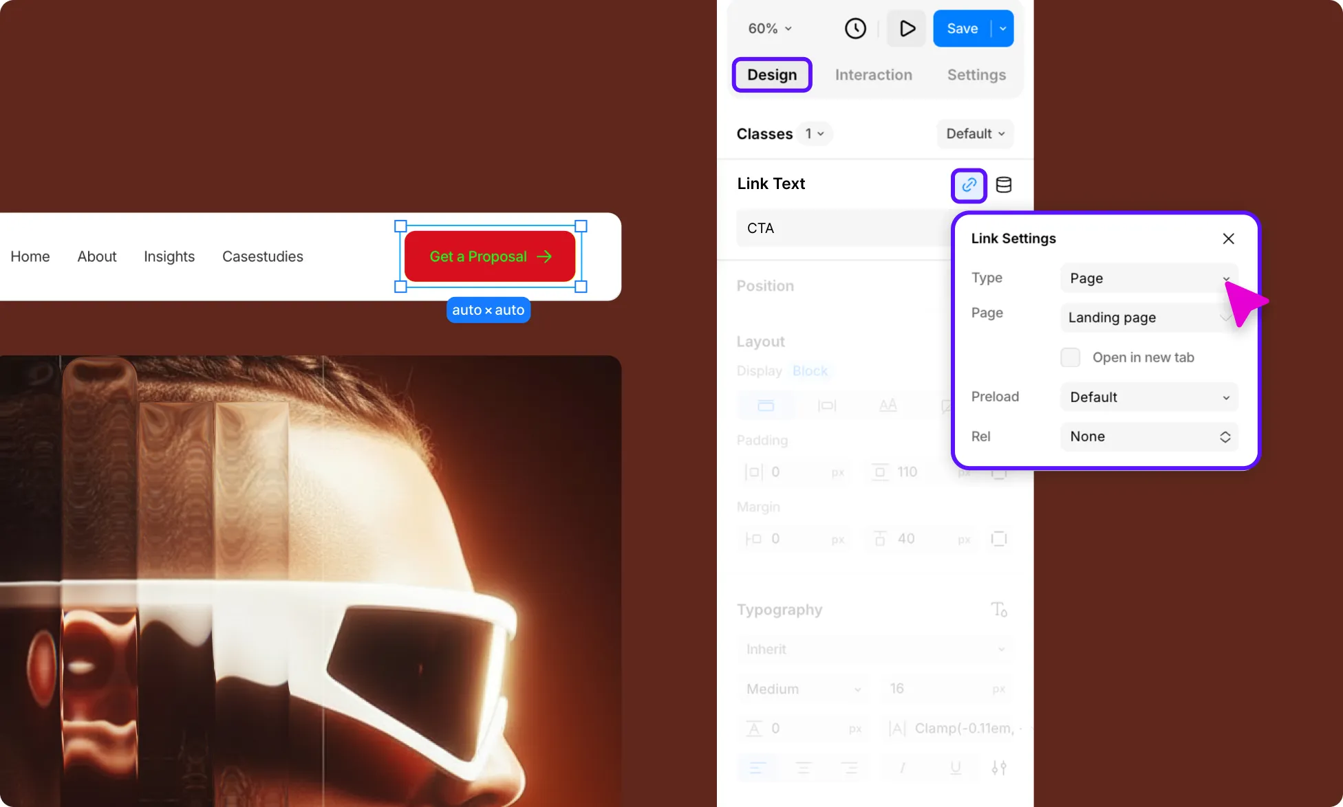
- In the Link Settings panel, choose a Type – for nav items, this is typically Page to link to pages within your site.
- Select the destination page from the Page dropdown, which lists all the pages in your site.
- Repeat for all Nav Items to make the Navigation functional.
How to Rename Navigation Items
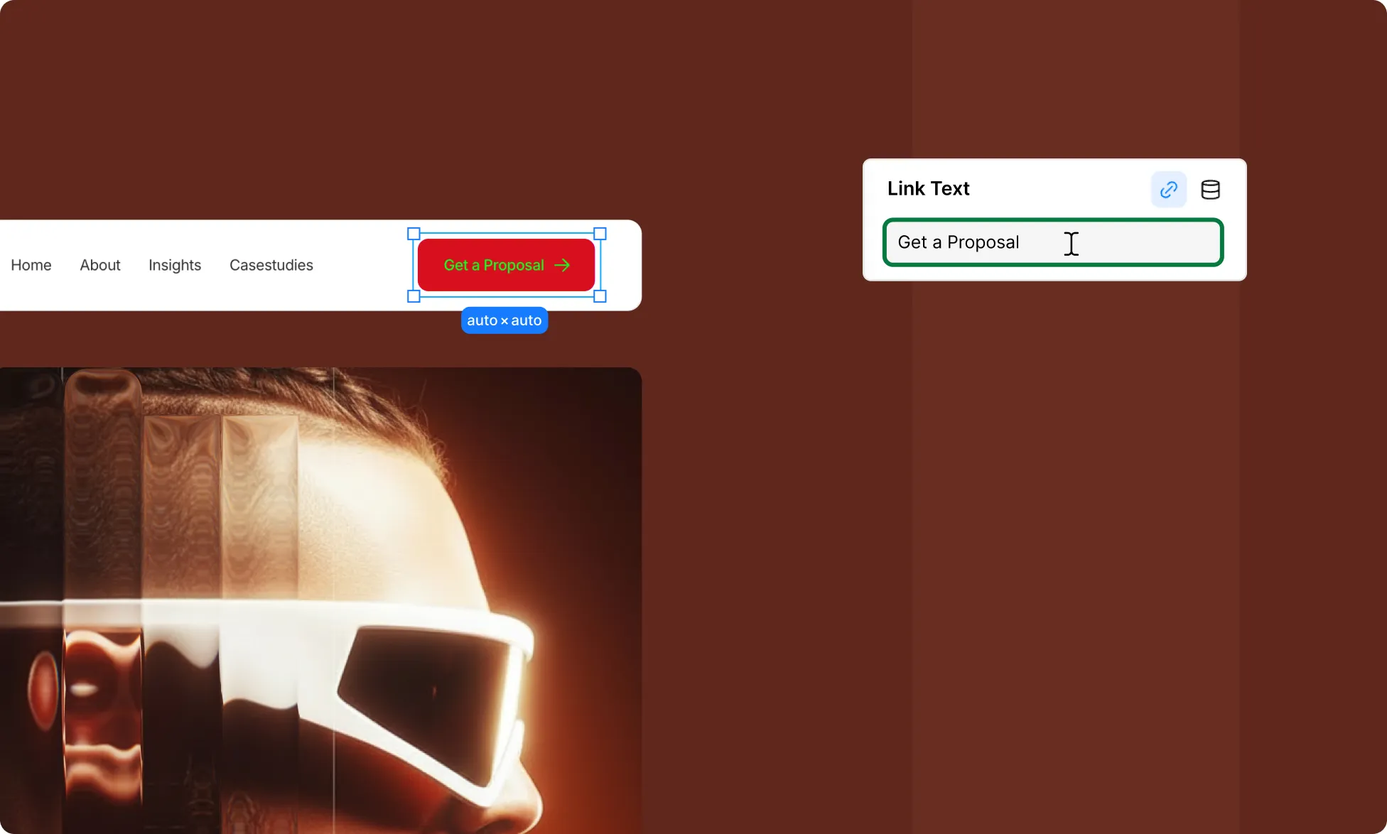
From the Canvas:
- Double-click the Nav Item’s Link Text you want to rename.
- Type its new name.
From the Right Panel:
- Alternatively, select the Nav Item’s Link Text you want to rename.
- Update the name directly in the Link Text field under the Design tab on the Right Panel.
How to Create a Submenu
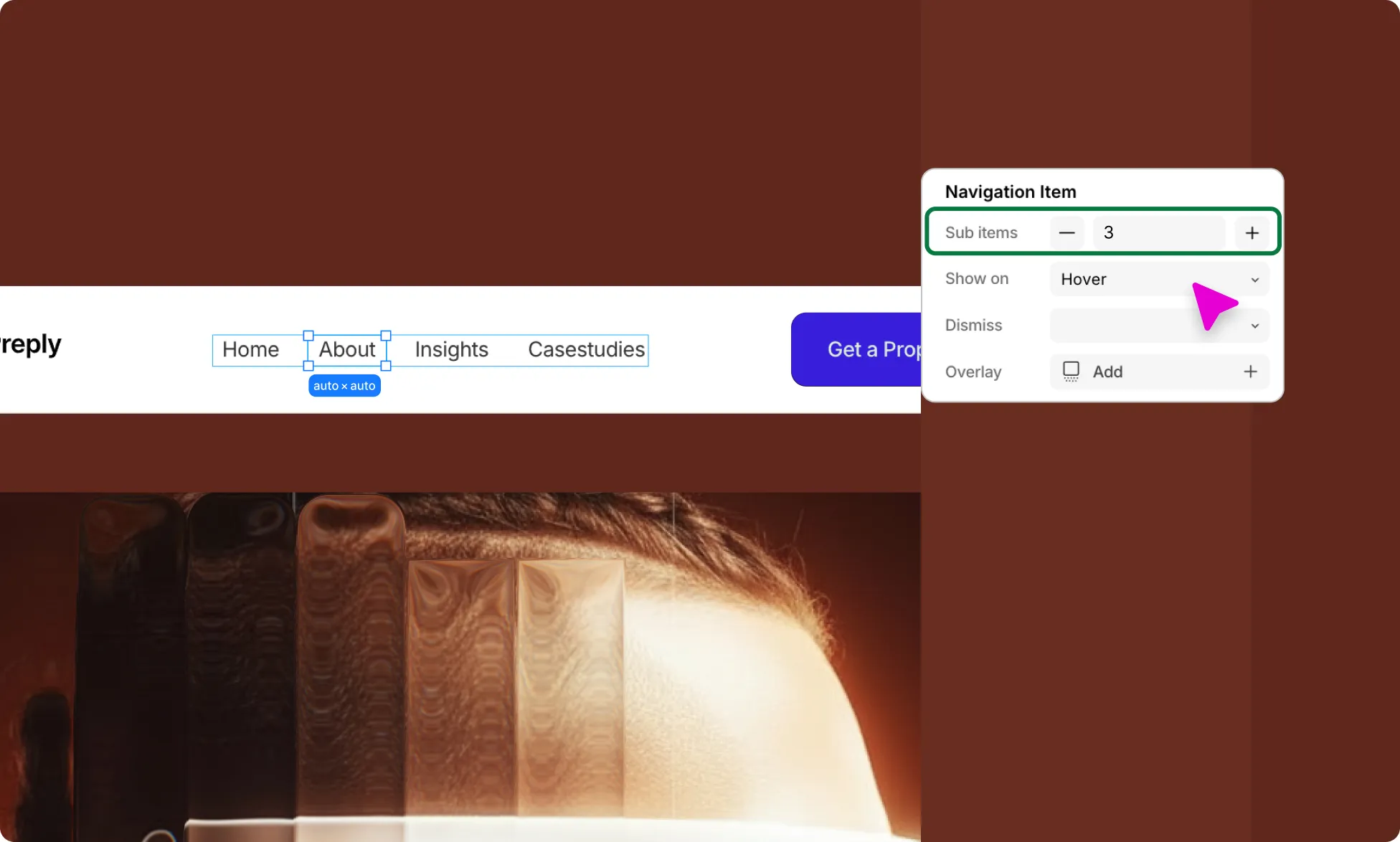
Instead of leading to just a page, a Nav Item can also be a submenu. Here’s how to add a submenu to your navigation:
- Select a Nav Item. You can do so from the Layers panel for more control.
- From the Design tab on the Right Panel, use the + and – buttons to add sub-items, creating a dropdown submenu under that nav item.
- Set when the dropdown appears using the options in Show On:
- Hover
- Click
- Always
- From Dismiss, set how the dropdown closes: Auto or Click.
- Lastly, enable or disable an Overlay for the dropdown.
Navigation Logo
The Nav Logo included in premade navigation blocks is an SVG element nested in a link block. Here’s how you can customize it:
How to Replace the Navigation Logo
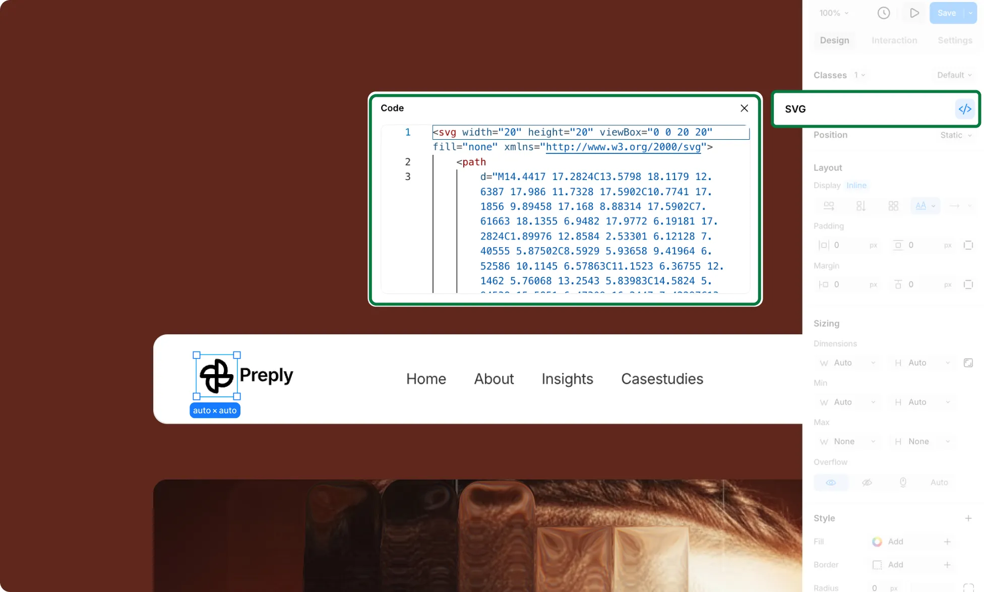
- Select the Logo on the canvas.
- From the Design tab on the Right Panel, click the code (< / >) icon beside SVG.
- In the panel that opens, paste the SVG code of your logo. Exit the panel to update it on the canvas.
Learn more about SVG.
How to Link the Navigation Logo
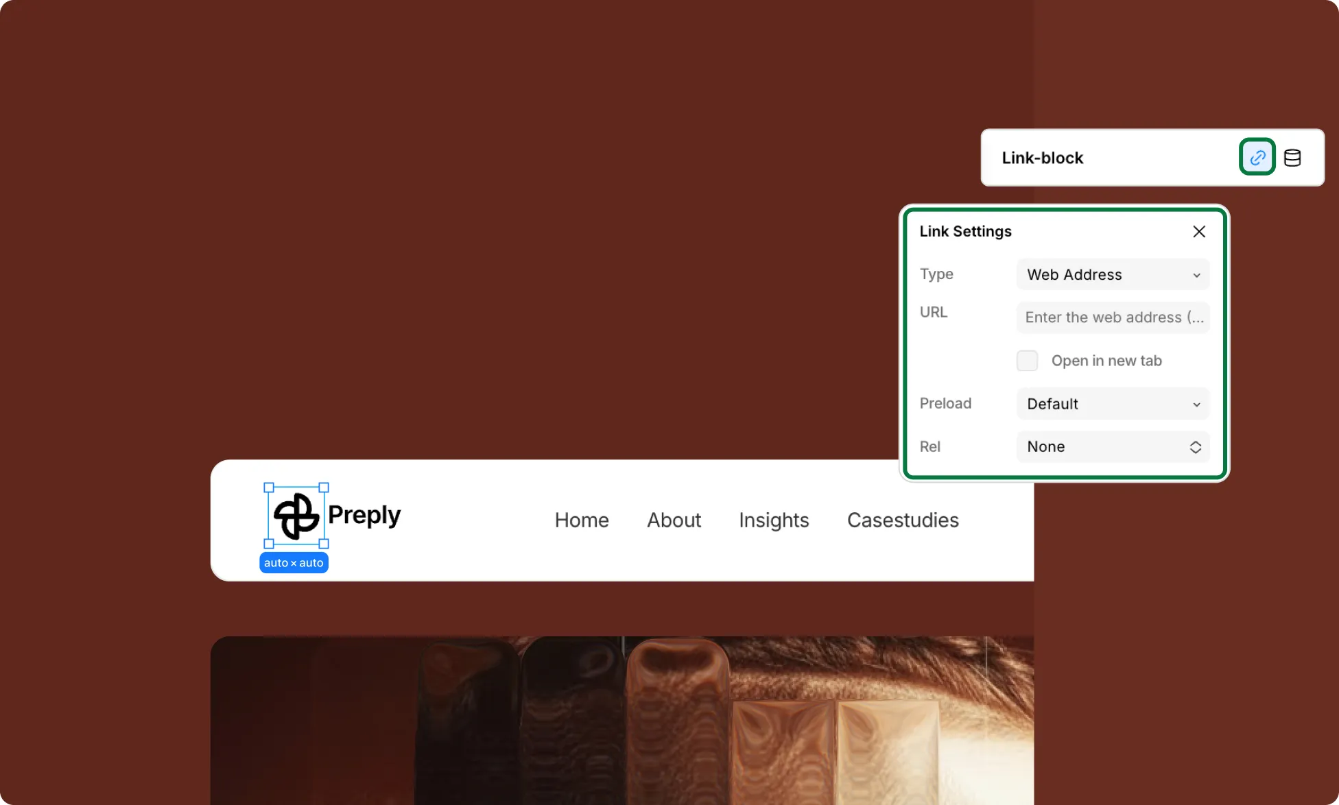
- Select the Nav Logo’s Link Block wrapper. You can do so from the Layers panel for more control.
- From the Design tab on the Right Panel, click the link icon under Link Text.
- In the Link Settings panel, choose a Type – a Nav Logo is typically linked to the home page, so the type here would be Page.
- Select the destination page from the Page dropdown, which lists all the pages in your site.
Responsive Navigation
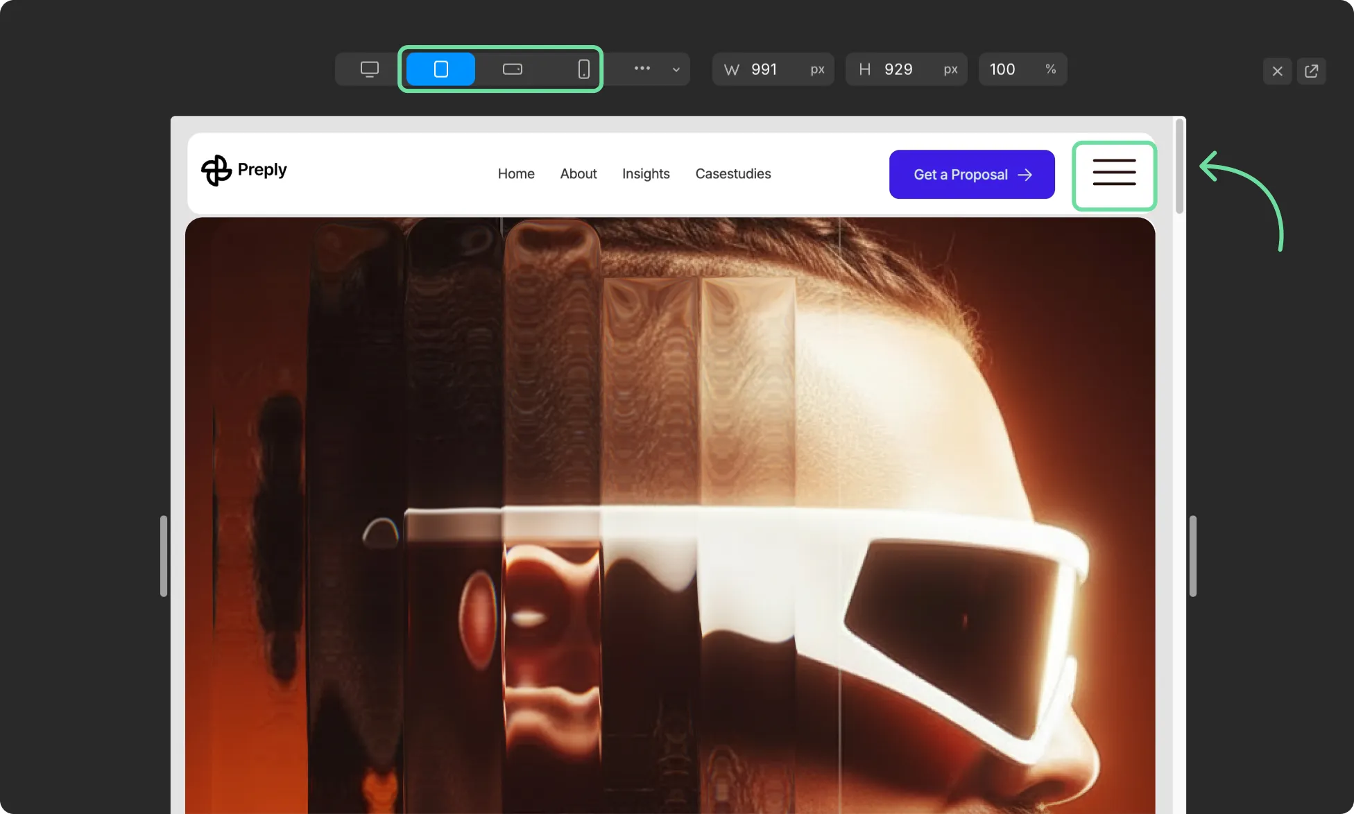
On smaller screens such as tablets and below, the Navigation element automatically collapses into a hamburger menu, ensuring your navigation remains clean and accessible across all device sizes.
Learn more about Responsive Design & Breakpoints.
Making Navigation Sticky
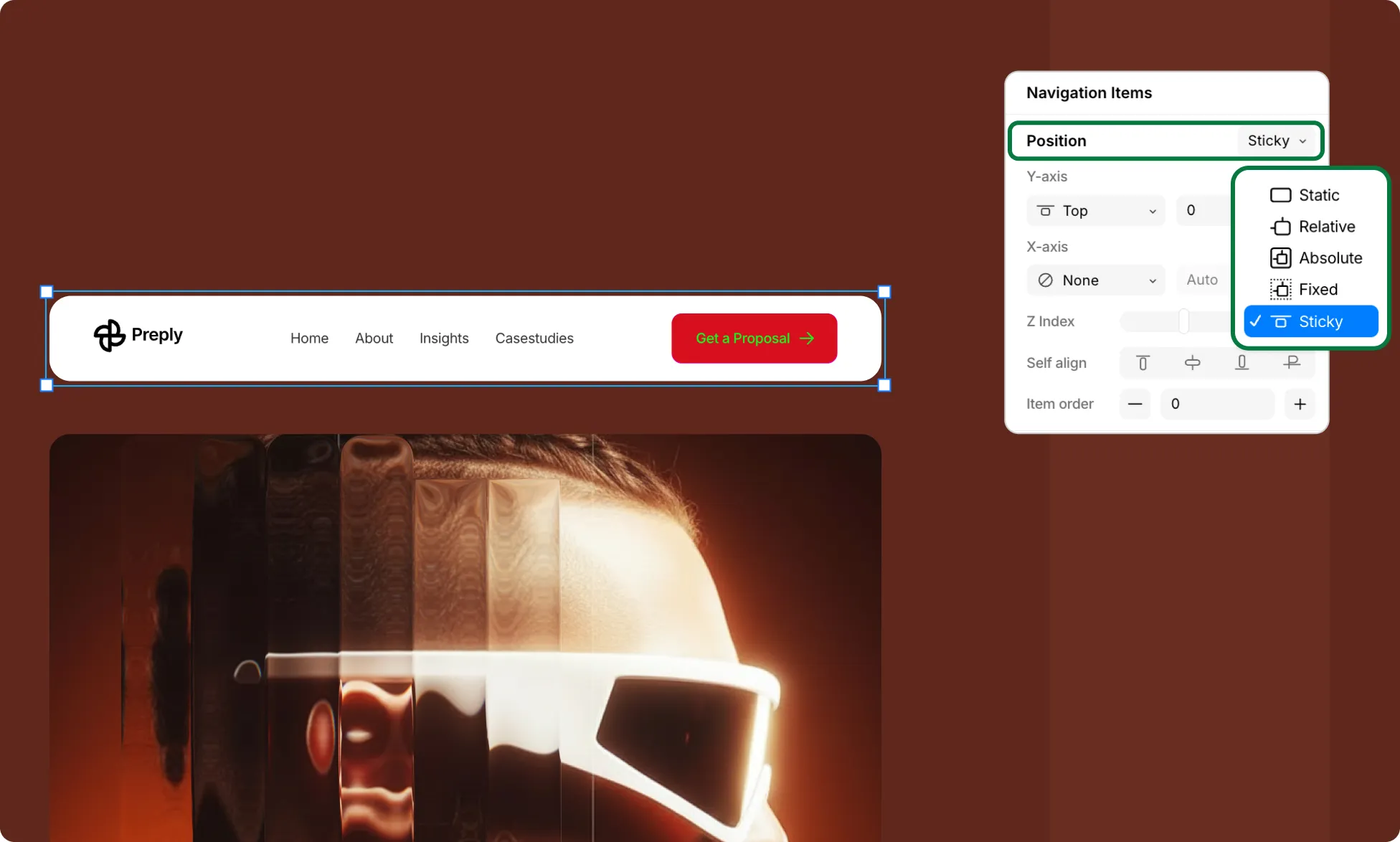
Making your navigation sticky is always a good choice, especially if your page is on the longer side, as it keeps the navigation accessible without users having to scroll all the way back up.
To make your navigation sticky:
- Select your Navigation wrapper, aka Header section, on the canvas.
- From the Design tab on the Right Panel, set Position to Sticky.
- Set the Y-axis to Top with a value of 0%.
- Set the Z-Index to 100 to ensure the navigation stays layered above all other elements on the page.
Learn more about Position.
Styling Your Navigation
You can further style your Navigation element using the options under the Design tab in the Right Panel. Learn More about Right Panel.