Pages and Layers Overview
In this guide, we’ll be exploring the Pages Panel, which is like your control center for navigating your project as well as managing the structure of any design.
From here, you can access Pages, Layers, and Assets, all in one place.
Access the Pages Panel
The Pages Panel is the very first option on the Left Sidebar.
To streamline your workflow, it’s set as your anchor. This means when navigating to other sections within the Left Sidebar, returning will automatically bring you back to Pages.
💡 Tip: You can also use the Keyboard Shortcut P to access the Pages Panel.
Pages
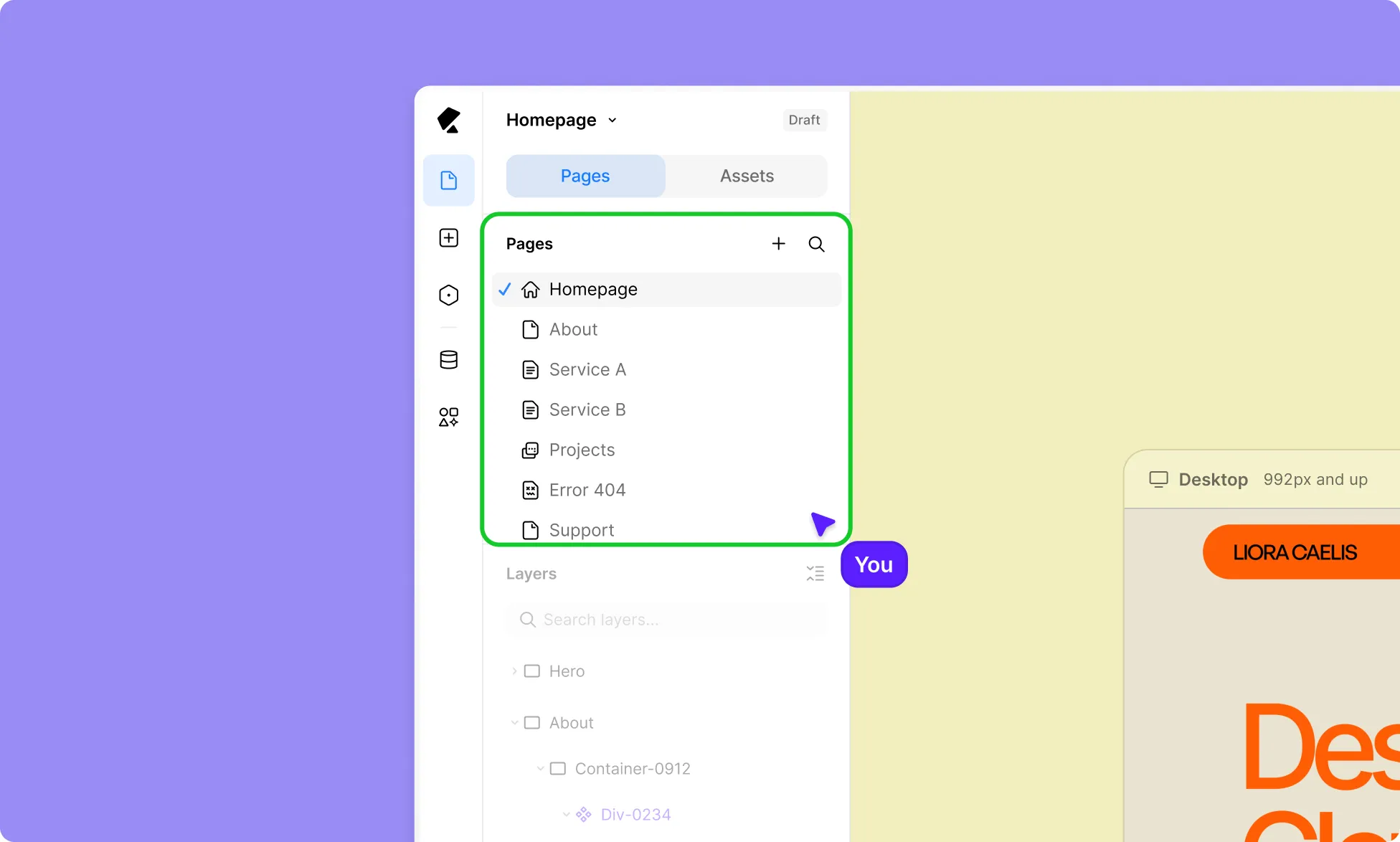
A website is made up of pages and often more than one, each designed for a specific purpose.
In Kirki, you can create as many pages as your project requires and easily access them all from the Pages Panel.
When you open the Kirki editor, a new page is created by default, giving you a starting point to begin designing immediately.
From the Pages Panel, you can:
- Create new Pages, popups, and more for different sections of your site.
- Switch between existing pages.
- Search and filter your pages.
- Access page settings.
Learn more about Pages.
Layers
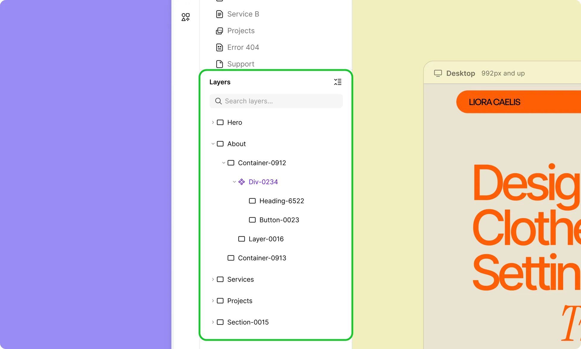
Any element added to a Page creates a corresponding Layer in the Layers section of the Pages Panel, where you can view, select, reorder, and manage them.
You can identify a layer’s type based on the different icons:
- Section
- Div
- Vertical Flex
- Horizontal Flex
- Grid
- Text
- Image
- Video
- Icon
- Shape
In layers, elements placed inside Container elements are displayed as nested layers. Use the arrow icons to expand or collapse these layers.
Learn more about Layers.
Components
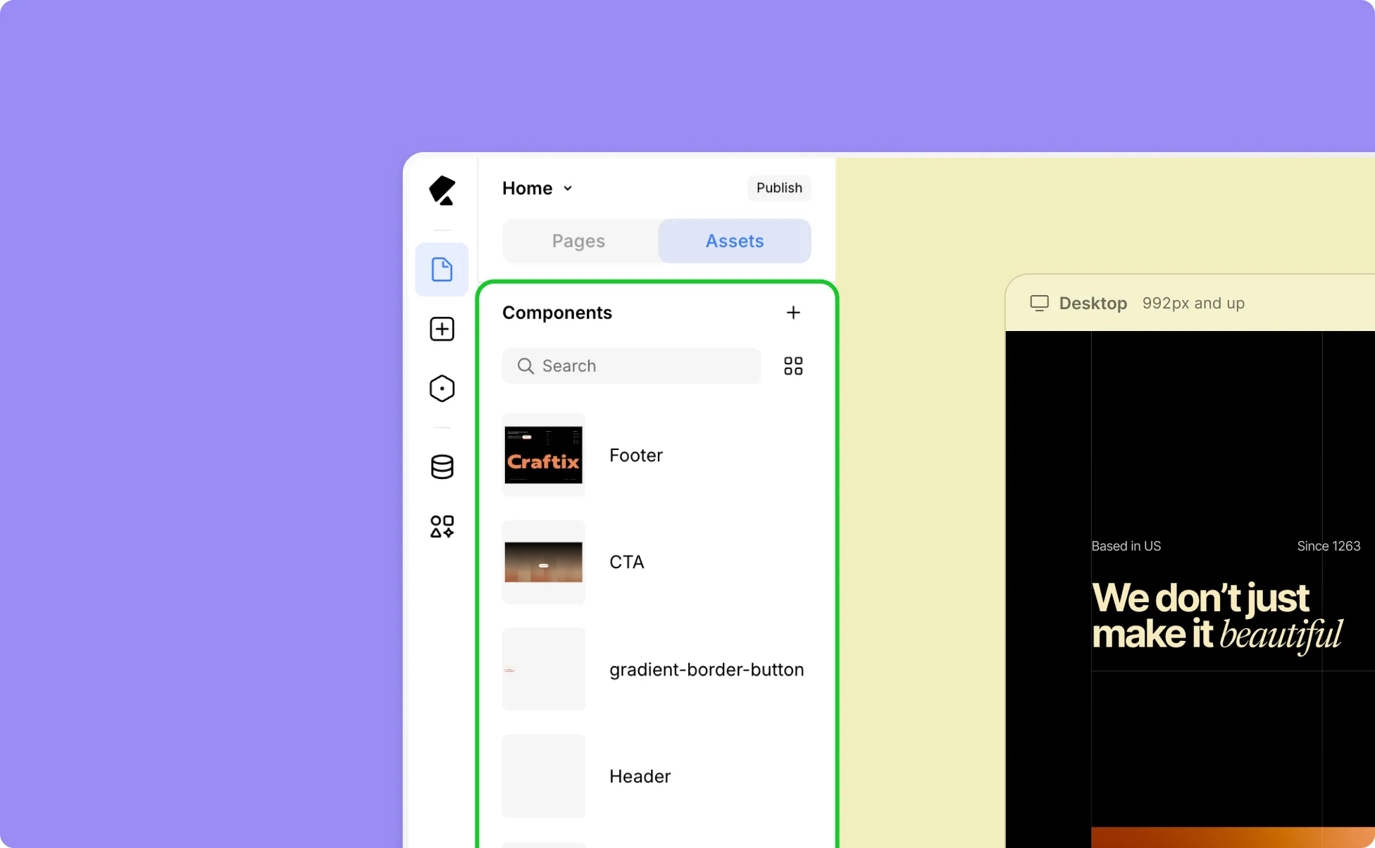
Components are reusable elements or a group of elements, such as sections, cards, buttons, or more complex UI structures that you can save and reuse across your project.
All saved Components are available in the Assets tab.
How to Use Components
Here’s how to use Components in your design and quickly build your page:
- Open the Assets Tab from the Pages Panel.
- Drag the desired Component onto the Canvas.
- Place it where needed.
A new instance of the Component will be created, allowing you to use existing designs without rebuilding from scratch.
Learn more about Components.
Was this page helpful?