Flex
The Flex layout in Kirki allows you to create flexible and responsive sections using CSS Flexbox, all through a visual interface.
What Is Flex
Flex is a layout in Kirki that uses CSS Flexbox to arrange its direct child elements in one dimension, either row or column.
It’s perfect for building horizontal navigation menus, vertical content stacks, split layouts, and more.
Flex Container and Flex Items
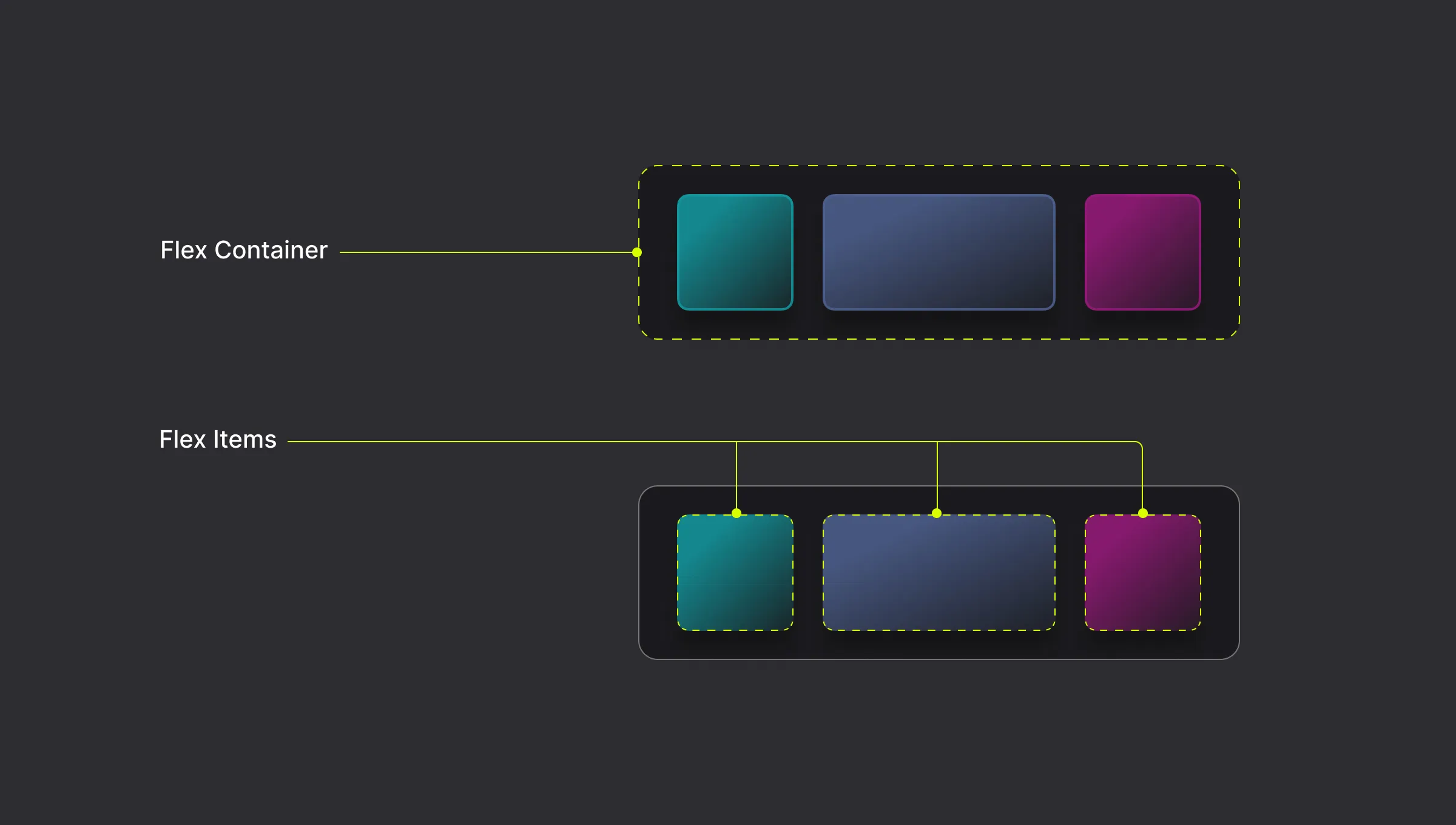
A Flex Container is the parent element, and the direct children of that element become Flex Items.
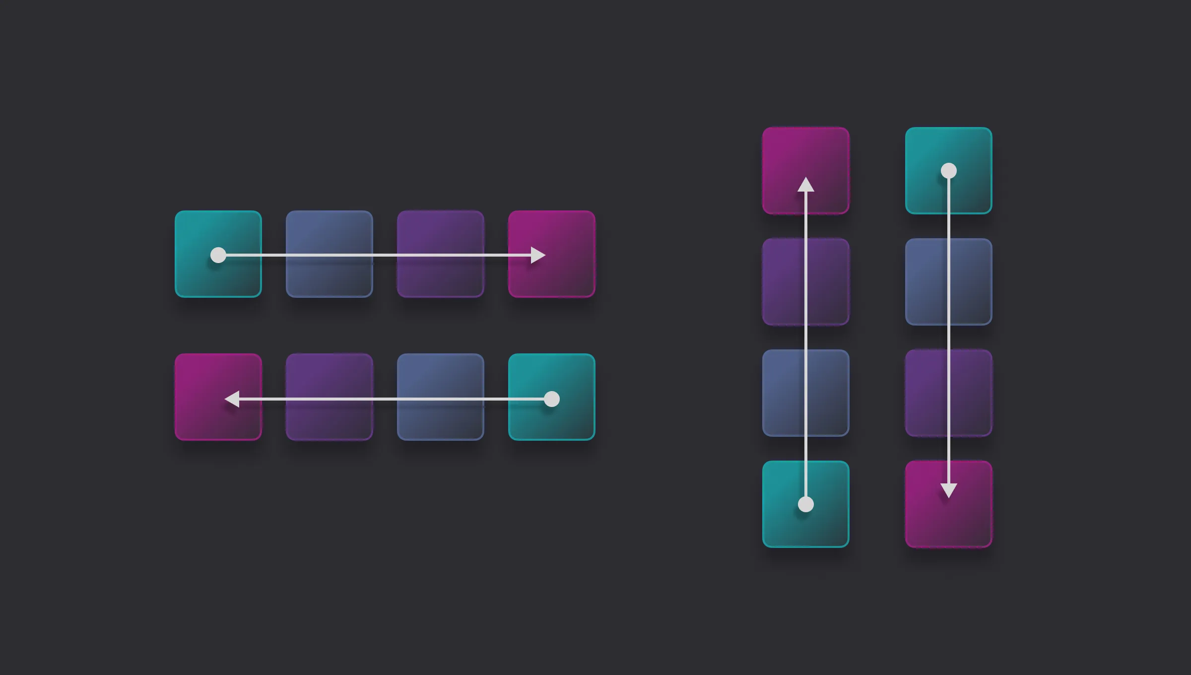
Cross-Axis
The cross-axis is the perpendicular axis to the main axis within a flex container. The main axis is defined by the flex-direction property, which can be set to a row or column.
For example, if the flex-direction is set to row, then the main axis will be horizontal, and the cross-axis will be vertical.
Horizontal Flex
Horizontal Flex arranges child elements left to right in a row. Use this for navigation bars, side-by-side cards, and hero sections.
Set Layout to Horizontal Flex
- Select an element on the page.
- Go to the Right Panel → Layout.
- Click the Horizontal Flex icon (two side-by-side rectangles) in the Display row.
Vertical Flex
Vertical Flex arranges child elements top to bottom in a column. Use this for stacked content such as cards, lists, form fields, or any container where items should sit on top of one another.
Set Layout to Vertical Flex
- Select an element on the page.
- Go to the Right Panel → Layout.
- Click the Vertical Flex icon (two stacked rectangles) in the Display row.
Flex Wrap
Flex Wrap controls whether flex items are forced into a single line or broken across multiple lines.
- Nowrap – All flex items are laid out in a single line, which may cause the container to overflow if there isn’t enough space. This is the default.
- Wrap – Flex items break into multiple lines when they run out of space, flowing in the same direction as the flex direction.
- Wrap Reverse – Behaves the same as Wrap, but the lines are stacked in the opposite direction.
Set Flex Wrap
- Select a flex layout on the page.
- Go to the Right Panel → Layout.
- Click the arrow icon next to the display options to access Flex Wrap options.
- Select the preferred wrap option from the dropdown.
Reverse Direction
You can also flip the order of flex items so they flow in the opposite direction along the main axis using the Reverse Direction toggle.
Flex Alignment
Control the alignment of items along the main axis and cross-axis.
Set Flex Alignment
- Select a flex layout on the page.
- Go to the Right Panel → Layout.
- Use the visual alignment grid for quick alignment or the X and Y dropdowns (each corresponding to one of the two flex axes) for the full range of options.
Main Axis
The main axis is the direction items flow, i.e., it’s the same as Flex Direction:
- For Horizontal Flex, this is the X axis.
- For Vertical Flex, this is the Y axis.
Along the main axis, you can control how items are distributed:
- Left / Top – Items are packed toward the start of the container.
- Center – Items are centered along the axis.
- Right / Bottom – Items are packed toward the end of the container.
- Space Between – Items are evenly distributed from the start or end. The first item sits at the start, the last at the end, and equal space is placed between each item.
- Space Around – Equal space is placed around each item, meaning the gaps between items are twice the size of the gaps at the edges.
- Space Evenly – Equal space is placed between every item and between the items and the container edges, so all gaps are the same size.
Cross Axis
The cross-axis runs perpendicular to the main axis:
- For Horizontal Flex, this is the Y axis.
- For Vertical Flex, this is the X axis.
Along the cross axis, you can control how items are positioned:
- Left / Top – Items align to the start of the cross-axis.
- Center – Items are centered along the cross-axis.
- Right / Bottom – Items align to the end of the cross-axis.
- Stretch – Items stretch to fill the full length of the cross-axis.
Flex Gap
The Flex Gap sets the spacing between flex items.
For Horizontal Flex, this space will be the column gap, and for Vertical Flex, this space will be the row gap.
It’s the cleanest way to create consistent spacing between cards, icons, or buttons without adding padding or margin to individual items.
Set Flex Gap
- Select a flex layout on the page.
- Go to the Right Panel → Layout.
- Set the value in the field below X & Y alignments, or adjust it directly on the canvas by hovering over the flex element and dragging the handle that appears between its children.
Flex Item
A flex item, also referred to as a flex child, has its own flex-specific settings for more granular control over its behavior within the container.
You’ll find these under Position in the Right Panel when the flex item is selected.
Self Align
Self Align controls the alignment of an individual flex item along the cross-axis, overriding whatever the container’s alignment is set to. Use it when one item needs to be positioned differently from the rest.
Unlike Flex Alignment, which applies to all items in the container at once, Self Align applies only to the selected item.
- Flex Start – Aligns the item to the start of the cross-axis.
- Center – Centers the item along the cross-axis.
- Flex End – Aligns the item to the end of the cross-axis.
- Stretch – Stretches the item to fill the entire cross-axis of the container.
- Baseline – Aligns the item’s baseline with the baseline of other flex items in the container. This option is typically used to align text within a line.
Item Order
Item Order controls the visual order in which a flex item appears within the container, independently of its position in the Layers panel. All items default to an order of 0.
Items with lower values appear first, while items with higher values appear last. Negative values are also allowed.
For example, an item with an order of -1 will appear before all items at 0, and an item with an order of 1 will appear after them.
Use Item Order to reorder items at different breakpoints without changing the underlying page structure.
Was this page helpful?