Grid
A Grid layout lets you divide any section into rows and columns, offering a flexible and precise way to structure your page.
It allows for clean, consistent designs without using float or position values.
Understanding Grid Layout
Grid Container and Grid Items
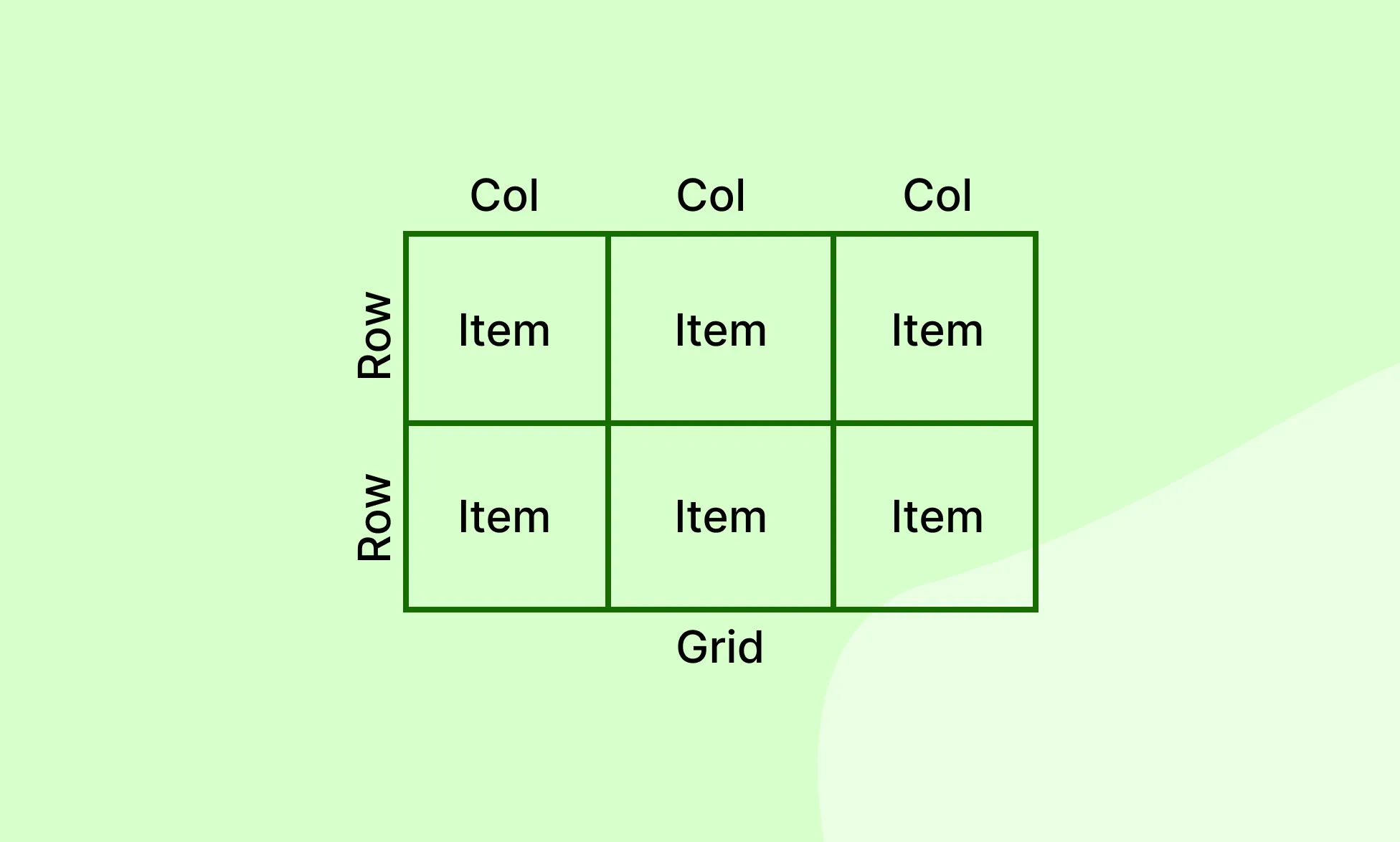
When you add a Grid, it becomes the Grid Container. Any direct child of that container becomes a Grid Item.
Grid vs Flex
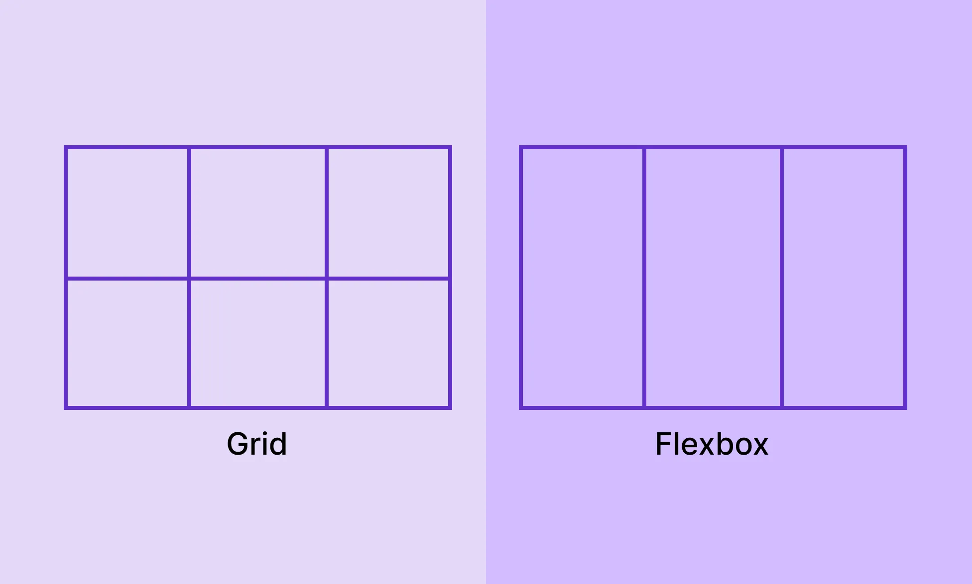
- Grid is two-dimensional – it handles both rows and columns.
- Flex is one-dimensional – it arranges items in a single row or column at a time.
Learn more about Flex.
Set Layout to Grid
- Select an element on the page.
- Go to the Right Panel → Layout.
- Click the Grid icon in the Display row.
Grid Columns & Rows
Once a layout is set to Grid, two number fields appear directly below the Display icons:
- The field marked by the Column icon (side-by-side rectangles) sets the number of columns.
- The field marked by the Row icon (stacked rectangles) sets the number of rows.
The canvas updates in real time as you change these values.
You can also click the Grid Preview next to the fields to visually set the configuration you want.
Column and Row Sizing
Control the width of each column and the height of each row individually:
- On the page, hover over the blue dot toggles at the start of a grid column or row to reveal the sizing field.
- Click the field to change the numeric value, or click the unit label to open a dropdown and switch between sizing units and modes:
- PX, %, REM, VH, VW – Standard sizing units where you enter a specific value.
- Fit Contents – The column or row sizes to wrap the content.
- Fill Container (1fr) – The column or row takes up a proportional share of the remaining space. This is the default.
You can also define the Grid Area from the same dropdown.
Add Content to a Grid
You can drop any element into a Grid Container, and it will automatically be placed into a cell.
Items are placed left to right, row by row – so the first item goes into the top-left cell, the second into the next cell to the right, and so on across the row. Once the row is full, placement continues from the leftmost cell of the next row down.
You can alter which element sits in which cell by changing their order from the Layers panel on the Left Sidebar. Simply drag and drop elements within the Grid Container layer to reorder them – their position on the canvas will update to reflect the new sequence.
By default, one element occupies one cell. To place multiple elements in the same cell, add a container element, such as a Div, into that cell and nest your elements inside it.
Grid Alignment
Control the alignment of items along the rows and columns.
Set Grid Alignment
- Select a grid layout on the page.
- Go to the Right Panel → Layout.
- Use the visual alignment grid for quick alignment or the X (row alignment) and Y (column alignment) dropdowns for the full range of options.
Horizontal Alignment (X Axis):
- Left – Item is aligned to the left of a grid cell.
- Center – Item is horizontally centered in a grid cell.
- Right – Item is aligned to the right of a grid cell.
- Stretch – Item is stretched to fill the full width of a grid cell.
Vertical Alignment (Y Axis):
- Top – Item is aligned to the top of a grid cell.
- Center – Item is vertically centered in a grid cell.
- Bottom – Item is aligned to the bottom of a grid cell.
- Stretch – Item is stretched to fill the full height of a grid cell.
Grid Gap
The Grid Gap sets the spacing between columns and rows in the grid.
- Column Gap – Sets the space between columns.
- Row Gap – Sets the space between rows.
By default, you’ll see a single Column Gap field below the Grid Alignment dropdowns in the Layout panel. Changing this value updates both column and row gap equally.
To set them independently, click the Padlock icon between the two fields to unlink them.
You can also adjust the gap directly on the canvas by hovering over the grid and dragging the handle that appears between cells.
Grid Areas
Grid Areas let you group multiple cells into a single named region and assign a grid item to span across it.
This is useful for layouts where certain items need to occupy more space than a single cell – like a featured image, a wide header, or a hero block within a grid.
Define a Grid Area
- On the page, hover over the blue dot toggles at the start of a grid column or row to reveal the sizing field.
- Click the unit label to open a dropdown and select Define Grid Area.
- On the Grid Container, each cell will now show a plus (+) icon. Click the plus icon on the cell where you want the area to begin. This assigns a new numbered area to that cell.
- To extend the area across additional cells, hover over the edge of the numbered cell until a drag handle appears, then drag it across the cells you want to include.
- To extend the Grid Area horizontally, use the left and right edges.
- To extend the Grid Area vertically, use the top and bottom edges.
- Next, select the grid item you want placed in that area.
- In the Right Panel → Sizing → Grid Item, switch to Area and select the numbered area from the dropdown.
Each click on a plus icon in an unassigned cell creates a new independent area.
Areas cannot be created by clicking plus icons on cells that already belong to another area – you can only extend an existing area by dragging from its edges.
Grid Item Settings
When a Grid Item is selected, you’ll find its specific settings across two places in the Right Panel:
Sizing
Under Sizing, the Grid Item section lets you switch between three placement modes:
- Auto – The grid places the item automatically. You can still define how many columns and rows it spans using the column span and row span fields.
- Area – Assigns the item to a named Grid Area. Select the area from the dropdown. See the Grid Area section above for how to create one.
- Manual – Gives you full control over the item’s placement using start and end lines for both columns and rows:
- Column Span – Sets where the item starts and ends horizontally.
- Row Span – Sets where the item starts and ends vertically.
Position
Under Position, you’ll find:
Self Align
Self Align controls the alignment of an individual grid item within its cell, overriding whatever the container’s alignment is set to. Use it when one item needs to be positioned differently from the rest.
Unlike Grid Alignment, which applies to all items in the container at once, Self Align applies only to the selected item.
- Row Start – Aligns the item to the left in its cell.
- Center – Horizontally centers the item within its cell.
- Row End – Aligns the item to the right in its cell.
- Column Start – Aligns the item to the top of its cell.
- Center – Vertically centers the item within its cell.
- Column End – Aligns the item to the bottom of its cell.
Item Order
Item Order controls the visual order in which a grid item appears within the container, independently of its position in the Layers panel.
All items default to an order of 0. Items with lower values appear first; items with higher values appear last. Negative values are allowed.
For example, an item with an order of -1 will appear before all items at 0, and an item with an order of 1 will appear after them.
Use Item Order to reorder items at different breakpoints without changing the underlying page structure.
Was this page helpful?