Design Responsively With Breakpoints
Kirki gives you multiple breakpoints at once and designs responsively simultaneously.
Breakpoints define the screen widths at which your layout adapts to different devices, such as desktops, tablets, phones, and more.
You start designing on the Desktop breakpoint – but you’re never confined to it. Simply zoom out or pan across the infinite canvas to see multiple breakpoints side by side.
This means you don’t have to switch back and forth; instead, you can design across devices seamlessly.
How Breakpoints Work in Kirki
Kirki’s breakpoints system is built to be intuitive, visual, and efficient. Here’s how it works:
The Base Breakpoint
The Desktop breakpoint is your foundation.
Any styling done here will carry across all breakpoints, unless you override them.
To streamline the process, start here and then refine the other screens as needed.
Cascading Breakpoint System
Styling in Kirki cascades from the Desktop breakpoint bidirectionally, upward to larger screens and downward to smaller ones.
For all other breakpoints, styling cascades in a single direction, either up or down, depending on their size.
For instance:
- Larger than Desktop: Changes apply to even larger screens.
- Desktop (Base): Changes apply to all breakpoints (unless overridden).
- Tablet: Changes apply to mobile landscape and smaller.
- Mobile Landscape: Changes apply to mobile portrait and smaller.
- Mobile Portrait: Changes apply to smaller screens.
And so on, following the same cascading logic across your entire breakpoint system.
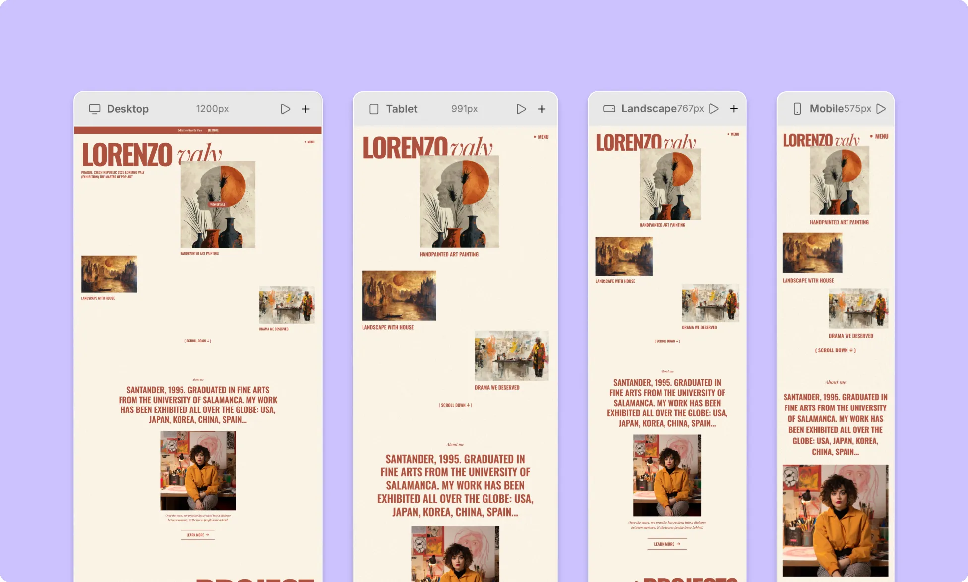
Side-by-Side Breakpoints View
Kirki gives you side-by-side responsive views for parallel responsive design.
This lets you easily:
- Compare design across devices
- Instantly spot responsiveness issues on other screen sizes
- Make adjustments and see the changes in real-time
How to Switch Between Breakpoints
There’s no “switching” between breakpoints in Kirki.
Everything lives on a single infinite canvas.
To work with breakpoints in Kirki:
- Zoom out (⌘ -) to see more breakpoints side by side.
- Pan across to move between breakpoints.
- Zoom in (⌘ +) to focus on one breakpoint.
Custom Breakpoints
For even greater control, Kirki lets you add unlimited Custom Breakpoints.
Custom breakpoints allow you to adapt your site to specific or uncommon screen sizes beyond the defaults.
This results in a consistent, seamless website experience across a wider range of devices.
How to Create Custom Breakpoints
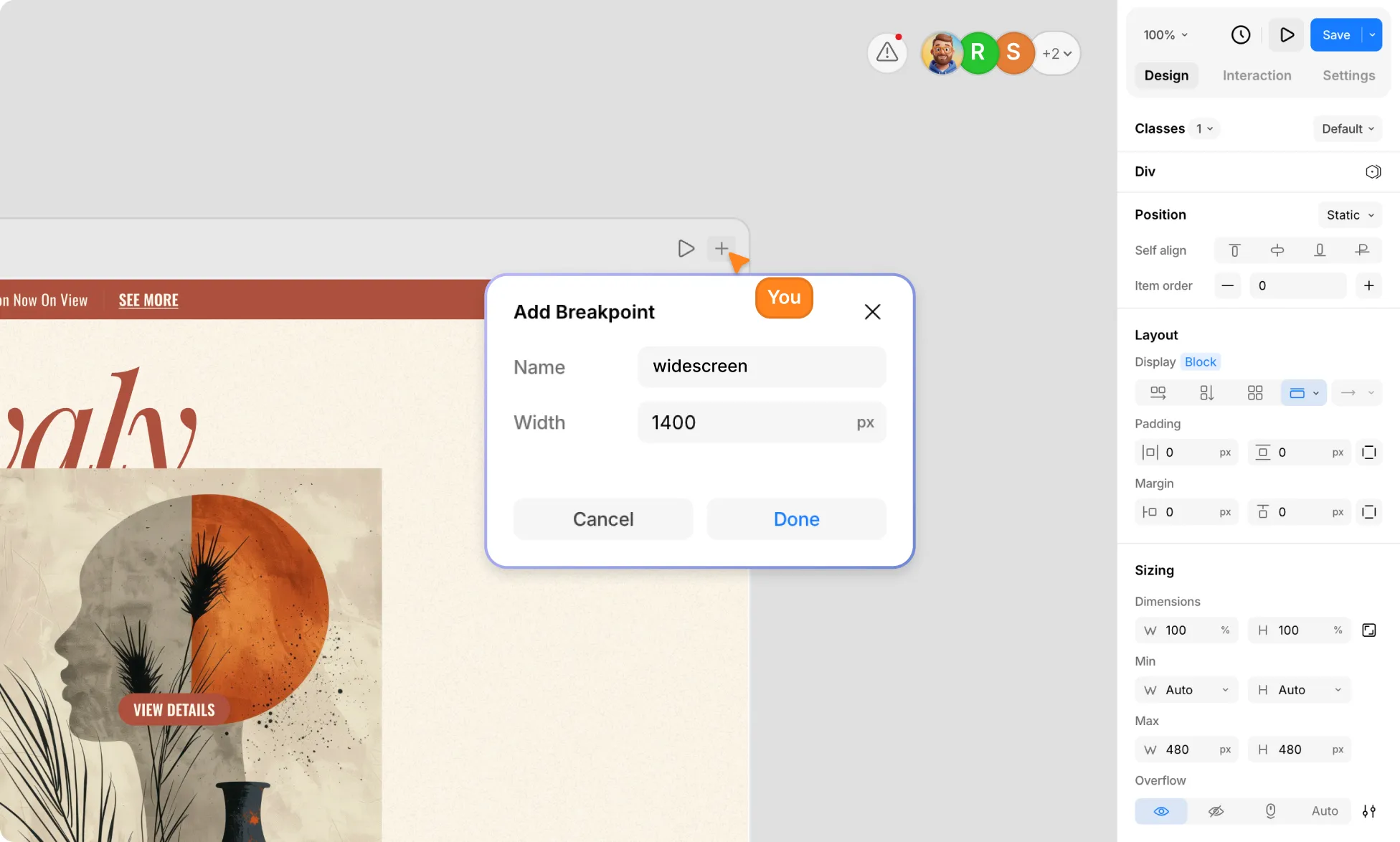
To define a custom breakpoint:
- Hover over the top of any breakpoint view.
- Click the plus (+) icon at the topbar’s right corner.
- Give your breakpoint a name and set its value.
- Click Done to confirm and move to the new breakpoint.
How to Edit Custom Breakpoints
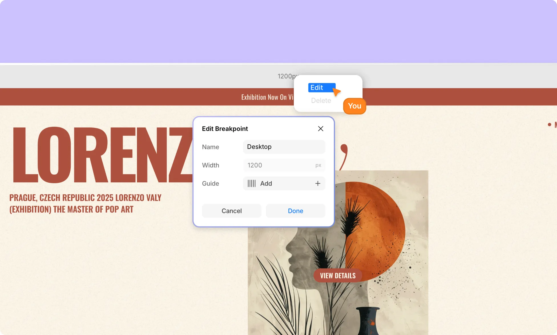
To edit a custom breakpoint:
- Right-click on the custom breakpoint topbar.
- Select the Edit option.
- Make your changes.
- Click Done to save your adjustments.
How to Delete Custom Breakpoints
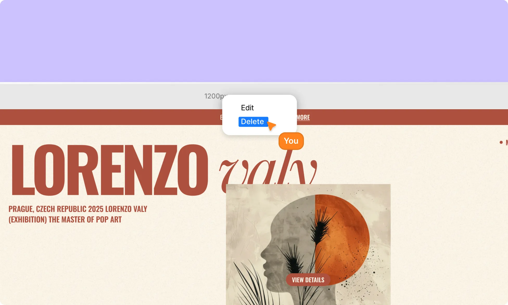
To delete a custom breakpoint:
- Right-click on the custom breakpoint topbar.
- Select the Delete option.
Changes That Apply to Breakpoints
Not all changes behave the same across breakpoints. Here’s how different types of updates affect your website design:
Design & Styling:
Changes to design properties such as layout, positioning, typography, interactions, and more, cascade across breakpoints.
You can override a property at any breakpoint, and that change will flow up or down accordingly without affecting unrelated breakpoints.
Content & Settings:
Content changes apply globally across all breakpoints.
This includes text, images, videos, and other media. Updating content in one breakpoint updates it everywhere, ensuring consistency across devices.
Element Settings:
Changes made in the Settings tab on the Right Panel also apply to all breakpoints, regardless of which breakpoint you’re currently working on.
Element Structure:
Element structure is shared across all breakpoints.
Reordering elements will reflect everywhere, and deleting an element removes it from all breakpoints.
If you want an element to appear only on specific screen sizes, you will instead need to hide the element.
How to Style Elements Across Different Breakpoints
Here’s how to design responsively in Kirki:
- Start with the Desktop element. It’s your foundation, and all breakpoints inherit from it.
- Once your base layout is in place, use the side-by-side view to spot where your design needs adjustment across screen sizes quickly.
- Apply your changes using the options in the Right Panel.
Your changes will cascade automatically, so you can efficiently build your responsive website without having to redo them over and over.
Hide Elements on Different Breakpoints
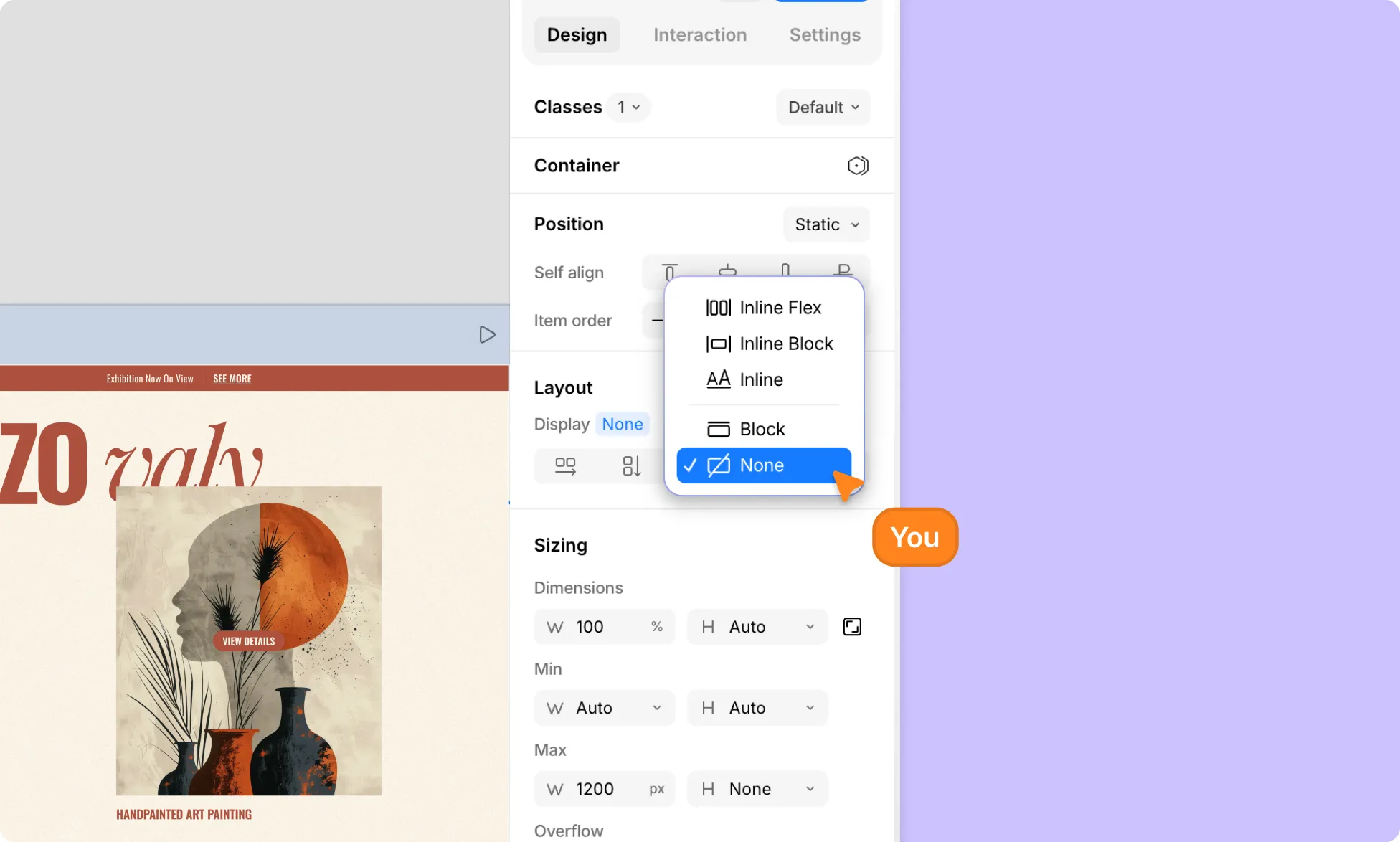
Deleting an element removes it from all breakpoints. If you want an element to be invisible on a specific breakpoint without deleting it, you can hide it instead:
- Select the element you want to hide.
- Open the Right Panel and go to Layout.
- Next to Display, click the arrow and set it to None.
📝 Note: Display is a style property, so it will also apply to all elements sharing the same class. Learn more about Class.
Was this page helpful?